Archetype 1: Comparison between options
This archetype is used to communicate the difference between options. The editable PowerPoint files for the examples of this archetype are provided at the end of this chapter for you to use and adapt, along with annotated versions of the archetypes to show the key elements in their design.
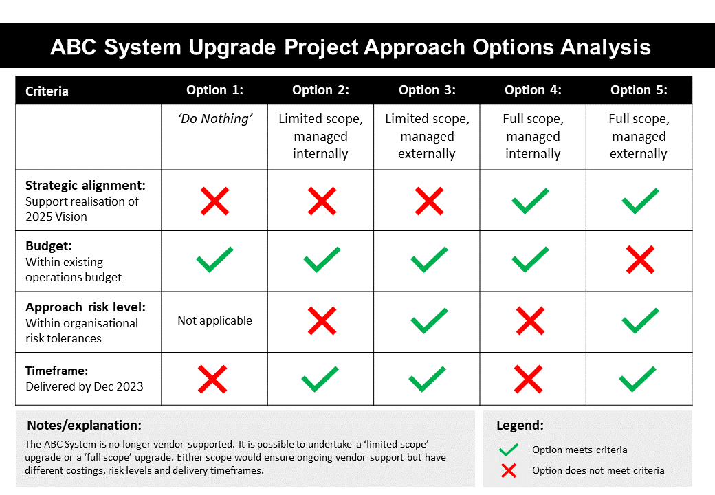
Example A: Comparison between options
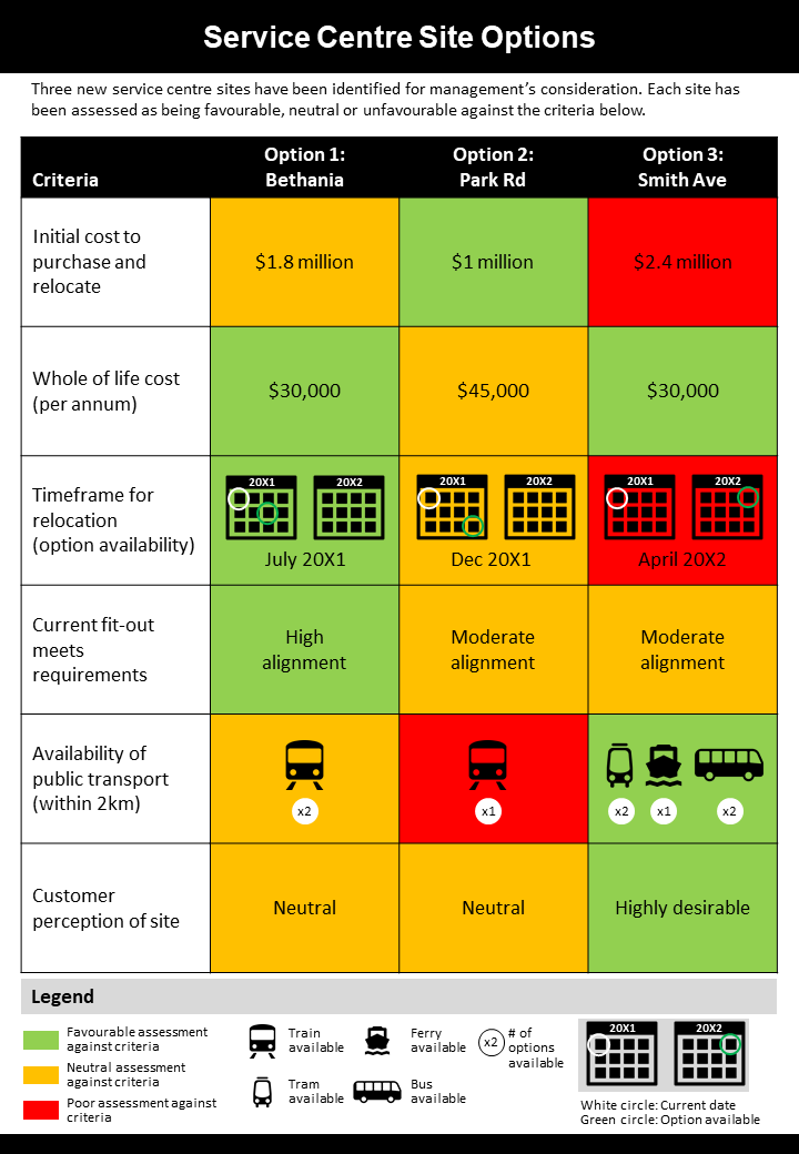
Example B: Comparison between options
Guidelines for tailoring the archetype
| Archetype | Comparison between options |
|---|---|
| Purpose | This visual archetype is used to communicate the differences between options. This may include: • comparing different delivery or staging approaches for a project • comparing different vendors/solutions for a project • comparing different projects within a program |
| Information you will need | • What are the options? • What are the criterion you are using to compare the options? • The value of the criteria for each option |
| Tips | • Try to compare a small number of options: 2 > 5 is best (up to 7 is possible) • Try to compare a medium number of criteria: 4 > 8 is best (up to 10 is possible) |
| Page layout | • If you have more options than criterion use landscape • If you have more criteria than options, use portrait This figure has a tabular style: • column headings are the options • row headings are the criteria • cell contents are the value of the criteria for the option |
| Text | Cell contents may be text or imagery, if using text: • dot points can be useful if you want to note a phrase • when comparing criteria, use the same syntax. For example, ‘Low risk’, ‘Medium risk’, ‘High risk’ across three options rather than ‘20%’, ‘medium risk’ and 'Risk: high’ • ensure your row and column headings stand out (bold and/or a larger size is better than underlining and capitals) |
| Imagery | Cell contents may be text or imagery. If using images: • use simple icons that have a similar style (line drawings/filled drawings, etc.) • provide a legend at the bottom of the page in case your icon is not clear to the reader, or include a cue word near the icon • ensure they reflect the colour scheme of the remainder of the page |
| Colour | Consider using a graduated colour scale to highlight more or less favourable assessments of value - for example, you may use dark orange (very poor), light orange (poor), blue (neutral), light green (good), dark green (very good) |
| Legend | Use a legend for: • abbreviations • colour coding • icons |
| Notes | • When comparing more than seven options, consider splitting the diagram across two pages, ensuring headings are repeated on every page • Include page numbers for more than one page |
Example A: Comparison between options (with annotations)
Click the blue information buttons on the diagram below to see annotations explaining the reasons for choosing these visual elements.
Example B: Comparison between options (with annotations)
Click the blue information buttons on the diagram below to see annotations explaining the reasons for choosing these visual elements.
‘Comparison between options’ templates
The templates above are freely available for you to use and adapt. You can download them using the links below:
