3. Visuals in project work
Building on the cognitive benefits of visuals presented in Chapter 2, this chapter presents the specific case for the potential benefits of visuals in project management. Project work has been described as a social and political process (Winter & Szczepanek, 2009). This challenging context requires the various stakeholders to make sense of the project world and to be in (sufficient) agreement to make decisions and move the project towards its objectives. Visuals can support this sensemaking process and this chapter introduces the historical foundations of the use of visuals in project work and then discusses recent studies that make a case for the use of visuals in project work. It concludes with reflections from project managers and executives on why visuals are particularly powerful in project work and the enablers required for project managers to communicate visually.
3.1 Sensemaking in project work
Many project practitioners expel significant effort in dealing with the sociopolitical complexity of project work. The concept of sensemaking can help us understand this complexity. Sensemaking is the process by which we derive the story, or make sense of a situation, based on various cues (Weick et al., 2005). The project environment, like all organisational environments, is replete with various sources of information (cues), and the possible interpretations of these cues is potentially as numerous as the number of stakeholders receiving the information. Much of the project manager‘s day can be spent trying to bring the various stakeholders, including project teams, project boards and other influential groups and individuals into alignment in terms of making sense of these cues and driving effort in the required direction (van der Hoorn & Whitty, 2017a). Given the potential cognitive benefits of visuals (see Chapter 2), it is unsurprising that visuals are commonly seen as a tool to support sensemaking, which often leads to decision-making in project work (see, for example, Ewenstein & Whyte, 2009; van der Hoorn & Whitty, 2017b).
Appreciating the process of sensemaking, and its importance in project work, is foundational to the development of effective visuals. Visuals, when appreciated through the sensemaking lens, have the purpose of assisting stakeholders to make sense of information to derive a story (or picture) of a particular facet of the project. Preparing effective visuals therefore relies on both understanding who will consume the information – and their preferences and priorities – and also understanding the various pieces of data and how they relate (see Chapter 6).
3.2 Visuals as ‘boundary objects’
The origins of the research on visuals in project management is found in the concept of boundary objects. Boundary objects are abstract or concrete artefacts – for example, plans and models in construction work, a project schedule, stakeholder matrix, or a list of project requirements – that meet the informational needs of various social worlds, and they are often visual in nature (van der Hoorn, 2020). Researchers have found that boundary objects can support negotiation (Alin et al., 2013; Di Marco et al., 2012), facilitate collaboration (Barrett & Oborn, 2010) and conflict resolution (Iorio & Taylor, 2014). Whilst boundary objects are commonly characterised as being ‘stable’ (unchanging), some researchers note that the very adaptability and potential evolution of such objects can help to move forward conversations and evolve knowledge in the project context: the visuals have agency (Comi & Whyte, 2018; Ewenstein & Whyte, 2009; Whyte, 2008).
Relating this concept of visuals having agency (power) in the project environment to the sensemaking processes it becomes evident that those who craft visuals exert significant influence on the sensemaking process. Returning to the term ‘boundary object’, visuals mediate between source information and those who are interpreting the information. It reminds us of the care to be taken when developing visuals and the way we as project managers creating visuals influence the sensemaking processes.
![]() 3.1 Concept exploration: Gantt charts
3.1 Concept exploration: Gantt charts
For many people, the Gantt chart is a visual that is synonymous with project management, but did you know that the Gantt chart, and more precisely its predecessor the Harmonograph is synonymous with scientific management and operational work (Debicki, 2015)?
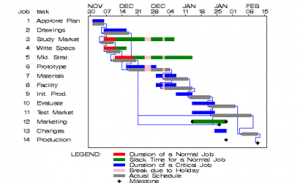
There is now increasing recognition that our connection of the Gantt chart with project management is problematic. The Gantt chart presents project work as being predictable and linear, as if it were ‘operational’ (Robles, 2018). This has the tendency to set unrealistic stakeholder expectations regarding the way the work will unfold and can be managed.
Research studies find that some project managers are aware of this conundrum and recognise that its worth is not necessarily in managing the work, but rather as a tool for helping build the confidence of stakeholders, or to meet their expectations of what project management entails (Whitty, 2010).
Even though project managers may feel frustration that they are expected, or perhaps even forced to use Gantt charts, they also manipulate this situation to their advantage and use Gantt charts to placate senior management and clients (or use high-level versions of a Gantt chart, for example, Archetype 4). As one project manager expressed, ‘It’s the Gantt charts that keeps my manager out of my office so I can get on with my work’ (Whitty, 2010).
This does not mean that visuals don’t have a place in scheduling and managing completion of activities within an initiative. Quite the opposite. Agile methodologies use Kanban-style boards as a central coordinating and tracking device to manage the team’s workflow, in the short to medium term. When used, for example, as part of the Scrum methodology, they are a visual tool that forms part of a broader system for holding team members accountable. For those interested in this style of work coordination there are several software options available including:
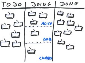 To summarise, when creating visuals we are deliberately or inadvertently communicating messages about a situation or choice through our design choices. For the Gantt chart, the neat lines, running from left to right in parallel rows down the page infer structure and order. It’s no wonder the Gantt chart is seen as a tool to build stakeholder confidence, even if it doesn’t directly enable project managers run their projects, and perhaps bends the truth of how the project will actually unfold. In the case of the Kanban board, attention is drawn to whether tasks on the board are moving at the expected rate, as agreed between members of the project team. As we will explore further in Chapter 5, visual language is powerful, and we need to be careful about the subtle inferences that can result from our visualisations.
3.3 Examples of using visuals in project work
Research on the use of visuals in management is still in its infancy (Beynon-Davies & Lederman, 2015; Davison, 2015; Goransson & Fagerholm, 2017; Maire & Liarte, 2018). However, there are an increasing number of studies that discuss the benefits of visuals in project work. The first discussed here is an example of a contemporary project management tool, the project-space model, that is used to support sensemaking on project status. The second example explores the use of visualised dashboards and maps in project portfolio management (PPM).
Discussing status with the project-space model
The project-space model (refer to Figure 3.1) has its theoretical foundations in Kurt Lewin’s force field analysis (Burnes & Cooke, 2013) which in simple terms, characterises action as being the result of competing forces (factors): a situation changes because one force is greater than other(s) (van der Hoorn, 2016b). The project-space model maps, in a visual manner, the current and potential enablers and constraints to a project’s progress (van der Hoorn, 2016b). The enablers and opportunities are factors that are currently or could potentially drive the project forward. Whereas constraints and threats are factors that are currently or could potentially hinder project progress.
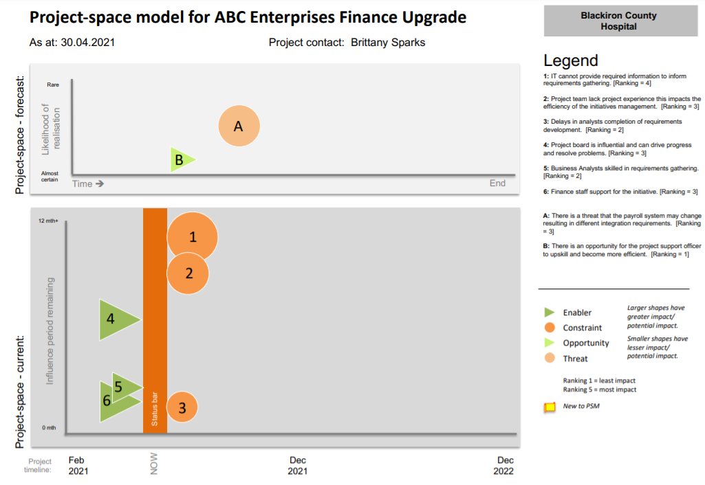
Note: A higher resolution file of the project-space model is also available.
Findings of an action research study of a large in-flight project revealed that the project-space model supported strategic and integrated sensemaking of project status at project board meetings (van der Hoorn, 2016a; van der Hoorn & Whitty, 2017b). Prior to the introduction of the project-space model the board had used traditional dashboard reporting and other text-based reports to discuss project status at its board meeting. Following use of the project-space model, project board members and the project manager reported that they felt better able to discuss the most pertinent factors influencing status in an integrated manner (van der Hoorn, 2016a). Through the scaled icons representing enablers, constraints, opportunities and threats the most influential cues were given attention during board discussions.
To summarise, in moving beyond traditional text-based reports and leveraging the design opportunities that visuals present, the project manager felt better able to communicate the project’s status and the project board perceived that their collective sensemaking capabilities were enhanced.
Visualised dashboards and maps in portfolio decision-making
The use of visuals in project portfolio decision-making was subject to a Project Management Institute (PMI) and University College London (UCL) funded research project (Geraldi & Arlt, 2015). PPM is argued to be an important domain for the application of visuals in project communication given the complexity of decision-making related to portfolios. For example, PPM decision-making needs to take into account interdependencies between projects, uncertainty and unavailability of information related to projects, and the sociopolitical complexity of joint decision-making processes (Geraldi & Arlt, 2015). Well-designed visuals are found to support decision-makers in managing this difficult decision-making context.
The PMI and UCL research project aimed to answer the question: ‘how to use and design visuals to support cognition of data in portfolio decisions?’ (Geraldi & Arlt, 2015). The study was executed with 204 student participants who were asked to make PPM decisions using various dashboards. The dashboards had varying degrees of incorporation of the principles that the researchers hypothesised would support PPM decision-making: (1) interactivity, (2) purposefulness, and (3) truthfulness, efficiency and aesthetic (refer to Figure 3.2).
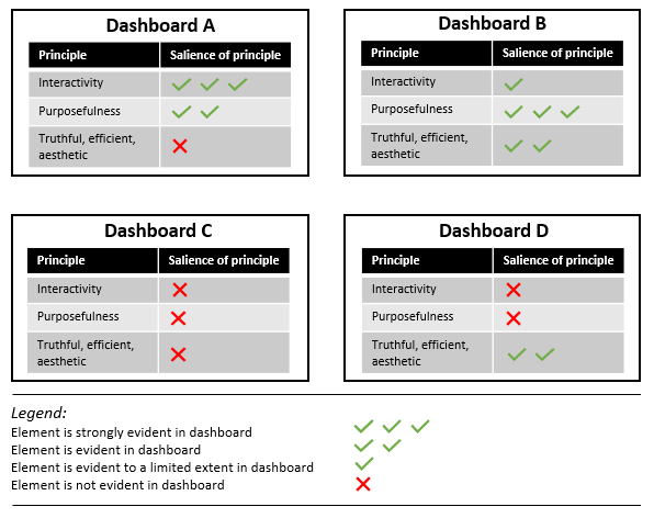
Evidencing the benefits of using well-designed visuals to support decision-making, Geraldi & Arlt’s (2015) study found that:
- adhering to the hypothesis design principles – particularly interactivity and purposefulness – leads to improved cognition
- the design of visuals needs to take into account the various perspectives that may be required to inform the decision-making
- consumers of visuals become familiar with particular visuals – be cautious (and incremental) when changing visuals and introducing new visuals.
A specific example of a visual in project portfolio decision-making with established benefit is the visual project map (Killen, 2022). A key strength of this visual is the representation of dependencies between projects. The ability to identify dependencies is central to portfolio decision-making and the visual project map exemplifies the benefits that visual representation can provide compared to narratives (or even tables). The visual project map is particularly useful in enabling decisionmakers to see the connections between initiatives and how the decision to include a project within a portfolio needs to be undertaken with reference to the other initiatives upon which it depends and for which its deliverables are a pre-requisite (Killen, 2022).
![]() 3.2 Concept exploration: visual project map
3.2 Concept exploration: visual project map
The visual project map allows decisionmakers to see the interdependencies between images. Take a look at slide three on this presentation for an example visual project map.
For a more scholarly exploration of the visual representation of project portfolio data, see Killen, C. P. (2017). Managing portfolio interdependencies: The effects of visual data representations on project portfolio decision making. International Journal of Managing Projects in Business, 10(4), 856-879. https://doi.org/10.1108/IJMPB-01-2017-0003.
3.4 The project managers’ and executives’ perspective on visuals
Senior managers or executives have a powerful influence on the sensemaking that arises from a set of cues. The two research studies presented above provide evidence of the benefits of using visuals in project work. However, recent research reveals the situational factors (the why) that make visuals particularly useful for engaging executives in project work (van der Hoorn, 2020). The study also derived a list of enablers that are necessary for project managers to be able to create visuals that are valued by senior managers and executives in project work.
In interviewing executives with experience in project work, van der Hoorn (2020) reveals that these key stakeholders are subject to a variety of dispositions or conditions that make visuals a useful tool to support their sensemaking and subsequent decision-making. For example, many executives reported that they may be required to provide direction/decisions for a project that is not within their primary area of expertise. As such, visuals can support them to understand new concepts and ideas with speed. Similarly, the majority of executives comment that they are under continuous time pressure in an environment of information overload, and they require information presented in a way that enables them to reach decisions quickly. Interviewed executives also reported benefits in the way that visuals supported them to onward communicate key messages relating to the project. Having a visual to take to a meeting with their senior colleagues or external stakeholders enabled them to more accurately share the story that needed to be communicated.
While these conditions facing executives influenced their desire for project managers to use visuals, the interviewees broadly agreed that the ability to visualise information was not a widespread project management competency, and many project managers did not necessarily appreciate the executives’ information needs. The interviewed project managers concurred and identified various enablers and hindrances to creating visuals that meet the needs of their executives. For example, skills in visualising are not commonly taught as part of project management education and this effects project managers’ confidence to visualise. Project managers also perceive that they are hindered by their organisations not providing the necessary software to create visuals nor direction on any standards for creating visuals. The interviewees noted information challenges that while not only relevant to visual communication are pertinent in creating truthful visuals. Sometimes it is not possible to get accurate or current data, and there are occasions where project managers feel being honest would have adverse repercussions.
This study highlights that whilst many executives will be disposed to appreciating visuals, many project managers feel ill-equipped or unsupported to communicate using visuals.
![]() Chapter 3 summary
Chapter 3 summary
- Sensemaking is the process of creating meaning from various cues in an environment about a situation – it is a key activity in project work
- Visuals can be described as boundary objects – a term used for artefacts that meet the information needs of various social worlds and can support sensemaking
- Research studies are increasingly reporting the benefits that visuals provide to support project work
- A number of conditions dispose executives to preferring visualised communication
- Project managers require various supports to enable them to be able to effectively create visuals that meet the needs of their stakeholders
![]() Recommended readings
Recommended readings
Sensemaking
- Weick, K. E., Sutcliffe, K. M., & Obstfeld, D. (2005). Organizing and the process of sensemaking. Organization Science, 16(4), 409-21. https://doi.org/10.1287/orsc.1050.0133
Benefits of visuals in project work
- van der Hoorn, B. (2016). Discussing project status with the project-space model: An action research study. International Journal of Project Management, 34(8), 1638-57. https://doi.org/10.1016/j.ijproman.2016.09.001
- Geraldi, J. G., & Arlt, M. (2015). Visuals matter! Designing and using effective visual representations to support project and portfolio decisions. Project Management Institute.
Media attributions
3.1 Concept exploration Image by Jean-Louis Zimmermann used under CC BY licence.
3.1 Concept exploration Kanban board by O.Tacke used under CC0 licence.
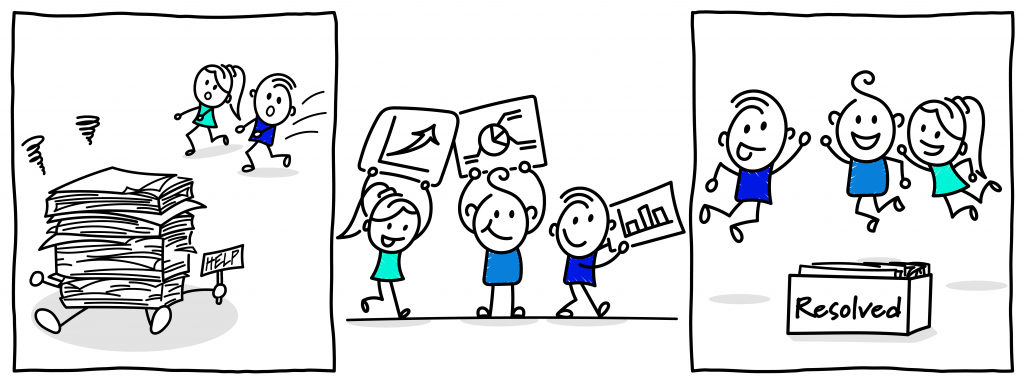
Cartoon: designed by Samara Hoffmann licensed under a CC-BY-NC-SA licence.
