1. A call to visualise
Young children love to draw. They have a confidence in expressing themselves that some might consider misplaced for their actual ability. A jumble of lines is proudly proclaimed to be a family portrait. However, for all but the most creatively inclined, as we grow older, we lose this confidence to draw – to express ideas visually. Research with project managers reveals that many do not feel they have the skills to visualise information, and their stakeholders comment that the ability to visualise is far from an inherent trait of the project manager, even though there is a growing preference for this type of communication (van der Hoorn, 2020).
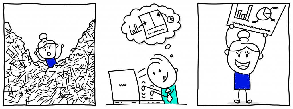
The reluctance to visualise is unfortunate given we are in an era of information overload. The problem that information overload creates for decision-makers is aptly described as ‘a poverty of attention and a need to allocate that attention efficiently among the overabundance of information sources that might consume it’ (Simon, 1971, pp. 40-41). Executives involved with projects are particularly vulnerable to this situation: not only are they time-poor, but sometimes they are required to make decisions outside their business as usual areas of expertise and will be held to account for these decisions (van der Hoorn, 2020). This creates a challenge for those seeking to engage or elicit decisions from these stakeholders. There is a need to prepare information in a manner that grabs stakeholders’ attention and conveys key messages efficiently and effectively. Visualised information can assist with this challenge. Human beings have limited working memory, but through the skilful visualising of information, our cognitive processing abilities can be enhanced (see Chapter 2).
![]() 1.1 Concept exploration: the power of visuals
1.1 Concept exploration: the power of visuals
At TEDGlobal in 2010 David McCandless presented on the power of visuals to portray the story or big idea in a dataset. He uses the phrase ‘data is the new soil’ to highlight the potential for visuals as a foundation for new understandings.
While the examples David shares are not related to project management, they highlight the potential of colour and space – amongst other elements of visual language – to communicate complex information and effectively compare different variables in a phenomenon. McCandless (2010) also draws attention to the way we are inherently attracted to visualised information.
The visuals presented in this book are static, two-dimensional and present information in a way that uses elements such as colour, space and scale to communicate meaning. All the visuals include text, but their design also leverages other elements of visual language (refer to Chapter 5). The archetypes have been designed as full-page examples. However, this should not preclude their inclusion in part or whole in more traditional documents or presentations. Using them can assist you to convey information in an efficient manner to your stakeholders to increase their understanding of complex project issues, to enable project boards and other senior stakeholders to make decisions, and to bring about engagement to drive action.
Visuals are not always superior to written or verbal information. As with all types of communication, understanding stakeholder preferences and information needs is essential to effective design (Geraldi & Arlt, 2015; Killen, 2022; van der Hoorn, 2020). However, the ability to communicate visually, and therefore reduce the time required for stakeholders to consume information and to leverage the full capacity of their working memory, can provide project managers with an advantage in influencing their stakeholders. Some types of information are particularly well-suited to visual representation. For example, comparisons; causality, mechanisms, structures, and explanations; and multivariate analysis (Tufte, 2006). Given the prevalence of discussions relating to time (i.e. structures), decision-making regarding delivery options or vendors (comparisons), and abundance of processes – from stakeholder analysis to risk and benefits management in project work (mechanisms), visuals can be particularly useful in this domain.
The need to influence is increasingly recognised as being at the core of project management. Research is now replete with examples of the insufficiency of technical skills – such as the ability to create a budget or schedule – alone to deliver projects. Rather, managing stakeholders, including the resolution of conflict, sensemaking, and bringing stakeholders into alignment, dominates the complex reality of being a project manager (Hoezen et al., 2013; Stevenson & Starkweather, 2010; van der Hoorn and Whitty, 2017a). Despite this recognition of the complex and human-centred nature of project work, education and training for project managers in these areas requires expansion (see, for example, Alam et al., 2010; Turner, 2016). The theories and practical tools provided in this book are a response to this call in an era that is synonymous with a visual turn in organisational life (Bell & Davison, 2013; Davison, 2015; Meyer et al., 2013). Specifically, the guidance on creating visuals (refer to Part B) and practical examples (refer to Part C) can provide much needed specificity to the generic guidance regarding communicating and engaging stakeholders in the time-pressured and messy world of projects.
![]() 1.2 Concept exploration: to visualise or not to visualise
1.2 Concept exploration: to visualise or not to visualise
Many project managers are already familiar with the advantages of using visuals to engage and influence their stakeholders. However, a simple quasi-experiment can reveal their power for those who are not yet aware of their potential.
Let’s take a classroom of students, not necessarily those involved in project management, but aware of general business concepts. The class are informed that for the purposes of the experiment they are members on a project board and are being asked to understand and answer a question relating to the risk profile and duration of the activities that are to be undertaken. Half the class are given a single-page visual which shows the activities in a timeline style with annotations related to risk level. The other half of the class are given a text-only memorandum which describes the duration of the activities and their risk level in paragraph format. The two groups of students do not know they have received different types of documents from which to answer the question. Once all students have received their ‘briefing document’ and the question to answer, a timer is set and students are asked to raise their hand when they have a response to the question.
Each time this experiment is run, there are more students who received the visualised briefing document who have a correct answer to the question in the first five minutes than their counterparts who received the text-only memorandum. This is unsurprising given that to answer the questions (i.e. interpret the briefing documents), the students in the memorandum group essentially need to create a visual in their mind’s eye to compare the activities to be able to answer the question. The group receiving the visual are not required to undertake this task of aggregating this information into a format to enable them to undertake the required task (answer the question). This result holds even when the students are unfamiliar with the style of the visual and receive no accompanying explanation from the facilitator.
This simple experiment, aligns with research that shows the importance of considering the purpose of communications and how we convey messages in a manner which are sympathetic to the needs (e.g. in this case making a particular decision which required a process of comparison) of the stakeholders (Geraldi & Arlt, 2015; Killen, 2022; van der Hoorn, 2020).
For those interested in the potential of visualisation to influence stakeholders, this passionate video by Hans Rosling shows how data visualisation can be used to raise awareness of social issues and affect positive change. While the video has a big data leaning that is beyond the scope of this book, the key messages about using the data we have to build enhanced understanding of complex issues are still highly relevant
The power of visuals for influence cannot be underestimated, but is caveated. Latour (1986, p. 4) cautions visualising information does not guarantee understanding: depending on how visuals are used they ‘may explain almost everything or almost nothing’. However, the potential influence for visuals is so significant that it has been argued that the rise of modern scientific culture, with the respect and esteem it begets, can (at least partially) be attributed to the power of visualisation to disseminate findings (Latour, 1986). The term ‘immutable mobiles’ summarises the nine reasons that Latour (1986) argues gives visuals their power: visuals are easy to distribute and can also be used in various ways – for example, as a focal point during an informal meeting, included in reports, or incorporated into formal presentations. He boldly states (1986, p. 17) that those who visualise badly lose the encounter – their fact does not hold. He also argues that when someone is in doubt about facts or contradictory information they will lean back to an available visualisation. It is the aim of this book to build your skills and confidence to use visuals to increase the influence of your communications.
With this potential to influence comes accountability (Tufte, 2006) and it is imperative to be mindful of the trust that stakeholders place in visuals. The act of visualising is not neutral, and the choices made in presenting information necessitates omission of some details in favour of others (Borland et al., 2018). Similarly, the norms and style conventions of visualisation can be deliberately manipulated to mislead stakeholders through misrepresentation of a situation (e.g. a misleading axis to suggest an increase or decrease in value when the opposite is the case). There is also a responsibility to use reliable, complete and accurate data as the basis of visuals (Killen, 2022) – not always an easy task in the rapidly changing and uncertain world of projects. The use of visuals is also not about simplifying complex data, but rather as Tufte (1983, p. 191) summarises, to provide a ‘clear portrayal of complexity’.
This book has three parts and has been designed to enable you to navigate between the chapters depending on your interests and needs. Part A is largely theoretical and is for those looking for justification of the value of using visuals. For example, Chapter 2 focuses on the scientific basis for using visuals in communications. It introduces the concept of working memory, its limits with a brief digression to consider the historical and cultural context which has given rise to visuals. Chapter 3, also theoretical, briefly reviews the case for visuals in project work. Part B provides practical advice necessary to cultivate your visualisation skills. Chapter 4, introduces software tools that can assist you to create visuals, and highlights that most practitioners will already have access to the necessary software for developing effective visuals. For those already creating visuals, it lists helpful web-based tools that can increase the efficiency and professionalism of your visuals. The norms and stylistic considerations (e.g. use of colour, iconography or scale) associated with visuals are outlined in Chapter 5. Chapter 6 illustrates a process for creating visuals and provides tips relating to file types and managing the drafting of visuals.
Part C contains the 12 visual archetypes that you can adapt for your own purposes. These archetypes range from timelines, to comparisons, to hierarchies. For each archetype, examples of the type of data suited to presentation in the archetype is outlined, followed by instructions on how to adapt the archetype for your communication need. Two examples are provided for each archetype, along with annotations on the examples to reveal the design choices. The examples of each archetype can be downloaded as a Microsoft PowerPoint file for adaptation.
Being the project manager is challenging and requires an ability to engage, inform and influence stakeholders, ranging from your project team to your project board and even external parties who can influence your project’s outcome for a variety of purposes that arise during project work. The ability to effectively visualise can give you the advantage to influence stakeholders in an environment where the capability to do so is more important than ever.
![]() Chapter 1 summary
Chapter 1 summary
- Many project managers lack the confidence and capability to create visuals
- Project stakeholders are commonly time-poor and experience information overload
- Many types of information in project work are well suited to visualisation (e.g. comparisons; causality, mechanisms, structures, and explanations; and multivariate analysis)
- The skills to manage – inform, engage, influence – stakeholders is critical for project managers and the ability to create visuals can provide an advantage in managing project delivery
- Creation of visuals is not neutral and carries with it an accountability for appropriately representing information/situations
![]() Recommended readings
Recommended readings
Stakeholder management in project work
- van der Hoorn, B., & Whitty, S. (2017). The praxis of ‘alignment seeking’ in project work. International Journal of Project Management, 35(6), 978-993. https://doi.org/10.1016/j.ijproman.2017.04.011
Inspiration to cultivate your visualisation skills
- McCandless, D. (2012). The visual miscellaneum: A colorful guide to the world’s most consequential trivia. HarperCollins.
Ethics in visualisation
- Borland, D., Wang, W., & Gotz, D. (2018). Contextual visualization. IEEE Computer Graphics and Applications, 38(6), 17-23. https://doi.org/10.1109/MCG.2018.2874782
Cartoon: designed by Samara Hoffmann licensed under a CC-BY-NC-SA licence.
