Archetype 2: Comparison over time
This archetype is used to communicate the difference in an organisation or situation over time. The editable PowerPoint files for the examples of this archetype are provided at the end of this chapter for you to use and adapt, along with annotated versions of the archetypes to show the key elements in their design.
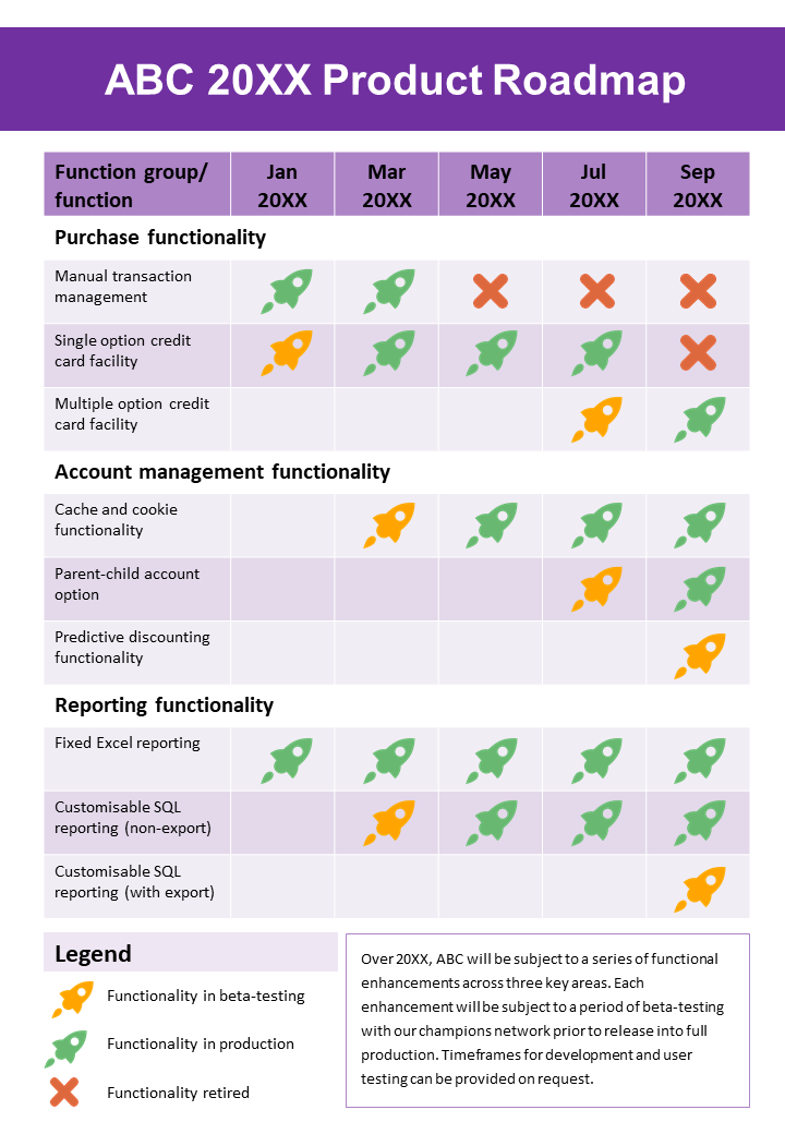
Example A: Comparison over time
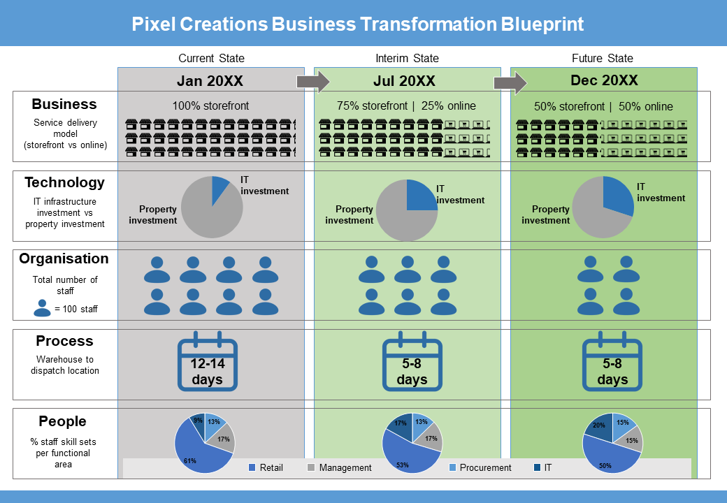
Example B: Comparison over time
Guidelines for tailoring the archetype
| Archetype | Comparison over time |
|---|---|
| Purpose | This visual archetype is used to communicate the difference in an organisation or situation over time. This may include: • comparing the ‘as is’ or current state to the ‘to be’ or future state of an organisation or situation • comparing the current state, interim states (e.g. end of project stages) and the future state of an organisation or situation |
| Information you will need | • What are the time periods you want to show (e.g. current state, future state, any interim states)? • What are the facets of the organisation or situation you are using to compare (you may use models such as BTOPP, or McKinsey 7S or some other categories that are meaningful for your purpose)? • The details or description for each facet at each stage |
| Tips | • Try to compare a small number of timeframes: 2 > 5 is best (refer to the section on page layout below) • Try to compare a medium number of facets: 4 > 7 is best |
| Page layout | • Generally, timeframes will be across the page (most readers will associate time with an invisible x-axis) • If you have less than five facets, you will probably be able to use a landscape layout • If you have many more facets than timeframe states, use a portrait layout • Always have the earlier state to the left of the page and later states to the right of the page This figure has a tabular style: • column headings are the states or periods of time • row headings are the facet of the organisation being compared • cell contents are the details/descriptions of the facets for each time period |
| Text | Cell contents may be text or imagery, if using text: • dot points can be useful if you want to note a phrase • when comparing criteria, use the same syntax. For example, ‘Low risk’, ‘Medium risk’, ‘High risk’ across three options rather than ‘20%’, ‘medium risk’ and 'Risk: high’ • ensure your row and column headings stand out (bold and/or a larger size is better than underlining and capitals) |
| Imagery | Cell contents may be text or imagery. If using images: • use simple icons that have a similar style • provide a legend at the bottom of the page in case your icon is not clear to the reader, or include a cue word near the icon • ensure images reflect the colour scheme of the remainder of the page You may also choose to use an arrow between row cells or column headings to highlight the time aspect of the diagram |
| Colour | If using colour, remember that readers will normally associate green with good and and orange/red with bad or poor |
| Legend | Use a legend for: • abbreviations • colour coding • icons |
| Notes | • If you have more than seven facets to compare consider combining two facets into a single row and highlight the most pertinent factor for the combined facets • Remember you are trying to bring to the fore what is changing over time. Depending on your purpose, there may not be value highlighting a facet that does not change over the time period being visualised |
Example A: Comparison over time (with annotations)
Click the blue information buttons on the diagram below to see annotations explaining the reasons for choosing these visual elements.
Example B: Comparison over time (with annotations)
Click the blue information buttons on the diagram below to see annotations explaining the reasons for choosing these visual elements.
‘Comparison over time’ templates
The templates shown above are freely available for you to use and adapt. You can download them using the links below:
