5. Visual norms and styling
Having some graphic design knowledge will improve the the visuals you create for your project stakeholders. This chapter explains basic design elements such as page layout, colour, iconography and shapes, and text. These elements form a palette of tools that are a visual vocabulary (Phillips & Phillips, 2014; Poulin, 2011). Most of us already feel comfortable using verbal and written language (text). This chapter provides a very brief introduction to visual language, and also how to align common charts and graphs with data types. For more information on graphic design elements and principles, refer to the Recommended reading list at the end of this chapter. The archetypes in Part C highlight the use of some of these elements.
5.1 Page layout
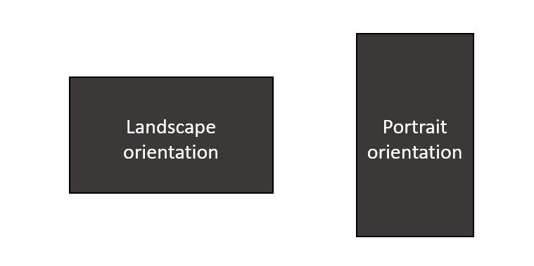
The blank page you start out with is a plane on which you will organise elements – such as text, shapes, icons, etc. – to create meaning (Phillips & Phillips, 2014; Poulin, 2011). Prior to starting to design a visual, consider how the visual will be read: onscreen or on paper. This will influence the page size you choose, and therefore the scale of text and other objects. For example, avoid setting up a visual on an A3 page if the visual is likely to be read on a phone or needs to be printed by stakeholders who only have access to an A4 printer – the content will become very difficult to read once scaled down! The decision on page orientation – landscape versus portrait as shown in Figure 5.1 – will depend on what you are communicating. The archetypes in Part C provide advice to help you decide whether portrait or landscape orientation is more appropriate.
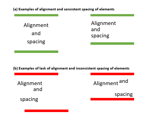
It can be useful to lay a temporary or even imaginary grid on your page to help align the elements. Many applications have tools that help you do this. Aligning elements vertically and horizontally (refer to Figure 5.2) brings ‘order’ and professionalism to visuals (Poulin, 2011). Being mindful of a ‘grid’ can also assist in equally distributing ‘space’ across the page. If there is insufficient white space on the page the visual can appear crowded and the message can be compromised. You can avoid overcrowding by ensuring there are sufficient margins around the edge of the page. This will also prevent content from being ‘cut off’ during printing.
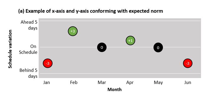
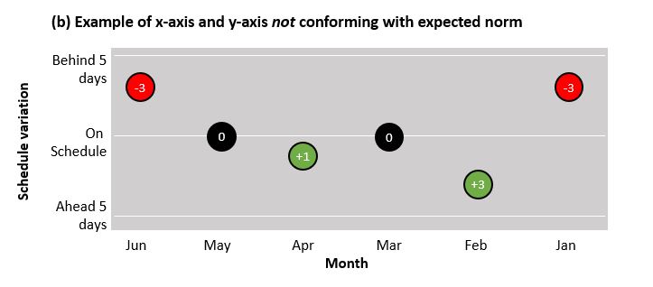
To reap the benefits of visuals, it is important that common norms relating to page layout are observed. For example, people in Western cultures read from top to bottom, left to right. Another example might be that we conceptualise time as going from left to right. Therefore it is customary to place earlier time periods on the left-hand side of page and later time periods on the right-hand side of the page. A similar norm applies to process flows. If the flow cannot be presented visually across the page from left to right, then it is preferable to go from top to bottom. It is also standard practice when representing numeric values to present larger values as being higher on the page or further to the right (refer to Figure 5.3).
5.2 Colour
Colour can be used to highlight difference or similarities, or create emphasis and draw attention (Adams et al., 2012; Phillips & Phillips, 2014). This chapter will discuss some basic elements of colour theory. Colour choice is one of the most important decisions when crafting visuals. Some readers may already be familiar with the colour wheel and concepts such as primary and secondary, or analogous colours. Knowledge of these concepts can be useful in selecting a palette that is visually appealing (Phillips & Phillips, 2014). Chapter 4 introduces some tools that can assist you with selecting a professional colour palette that observes the principles associated with the colour wheel. As a guiding principle, for corporate visuals, select palettes that are not too garish and ideally align with the organisation’s style/communication guide. Using a harmonious, professional palette increases a visual’s perceived authority and legitimacy.
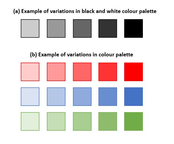
It’s easy to assume that stakeholders will be viewing the visual ‘in colour’. If it’s likely the visual will be printed in black and white this should be considered from the very start of the design process. Greys (refer to Figure 5.4 (a)) can be used to create meaning within the limitations of a black and white palette, although you will likely need a legend to assist with interpretation. Variations in colour intensity –sometimes achieved through the transparency setting in an application – can also be used with colour palettes (refer to Figure 5.4 (b)). If the visual uses multiple intensities of the same or similar colours, it is important to continually check the visual in the medium – for example, on paper if it will be printed – to confirm the colours are showing as intended and with sufficient differentiation (Poulin, 2011). Effective design of visuals also needs to take into account stakeholders who may be colourblind (Lawson, 2015). In such cases meaning conveyed by colours can be communicated in a secondary manner – for example, through shapes or icons (refer to Figure 5.6).
Given that many project stakeholders will have a corporate frame of reference, there can be significant benefit in using ‘traffic light’ colours for project visuals. It’s broadly understood that red in corporate dashboard-style reports implies negativity – a problem or complication or some other undesirable situation. Orange is better than red but is still of concern, signaling a potential problem, whereas green is commonly interpreted as going well or being on track. It is also possible to use the intensity concept to increase the granularity of the traffic lights – i.e. darker versus lighter green to differentiate between more or less positive. This ‘traffic light’ norm can be used to advantage, but equally if these colours are used to mean something different it is important to ensure stakeholders are cognisant of how the colours should be interpreted, to avoid the stakeholder using a previous frame of reference to interpret their meaning.
5.3 Iconography, shapes and scale
Icons and shapes are visual elements that can also be used to create meaning. Icons can be classified as verbal, pictorial or abstract (Griffin & Takakuwa, 1995). Verbal icons use alpha or numeric symbols known to a specific population – for example, a currency sign for dollars or pounds. Pictorial icons are representational, meaning they should be similar to the thing they represent – for example, an icon of a plan landing to indicate an airport. Abstract icons can be representational but the scope for interpretation can be significantly broader – for example, the icons we associate with public bathrooms. For abstract and verbal icons, it’s important to be aware of stakeholders’ frames of reference. If the visual is conveying process information and the stakeholders are a team of programmers or analysts who understand business processing modelling notation (BPMN), using the symbols associated with this notation will be effective – even though they’re abstract icons they’re understood by the stakeholders using the visual. Similarly, those who have worked extensively with project schedules may associate the diamond shape as being representative of a milestone.
Basic shapes such as circles, squares and triangles can be used as abstract icons where there are no established icons that would be understood by stakeholders. Contemporary software allows the manipulation of these basic shapes to preserve the standard sharp angles or to soften their style. It’s common that stakeholders associate soft, curvilinear shapes as inferring less certainty than sharp, angular shapes (Poulin, 2011). This common interpretation can be used in design to enhance the messaging or ‘tone’ of the visual. This inference is further explained in Concept Exploration 5.1.
 5.1 Concept exploration: Bouba and Kiki
There are a number of studies that have explored how people associate abstract shapes –one rounded and the other spikey – with ‘non-words’. Across many studies it’s been found that when asked to assign the terms ‘Bouba’ and ‘Kiki’ to the shapes below, the majority of participants associate the shape on the left with the word ‘Kiki’ and the shape of the right with ‘Bouba’ (Cuskley et al., 2017). This experiment is an example of how we make inferences regarding the meaning/interpretation of shapes based on their geometric features.

The scale or size of elements on a visual also creates meaning. Larger elements, whether text, shapes or icons, will likely receive increased attention and be perceived to have greater importance or significance than smaller elements. Scale is relative within a visual (Phillips & Phillips, 2014). Consider Figure 5.6, which shows the comparative cost of projects within a portfolio by using circles of varying sizes to indicate project cost. Be mindful of legibility when scaling elements. Particularly when a visual is conveying a significant amount of information there can be a tendency to shrink the size of text, icons and shapes, but this can compromise the readability – and therefore usefulness – of the visual.
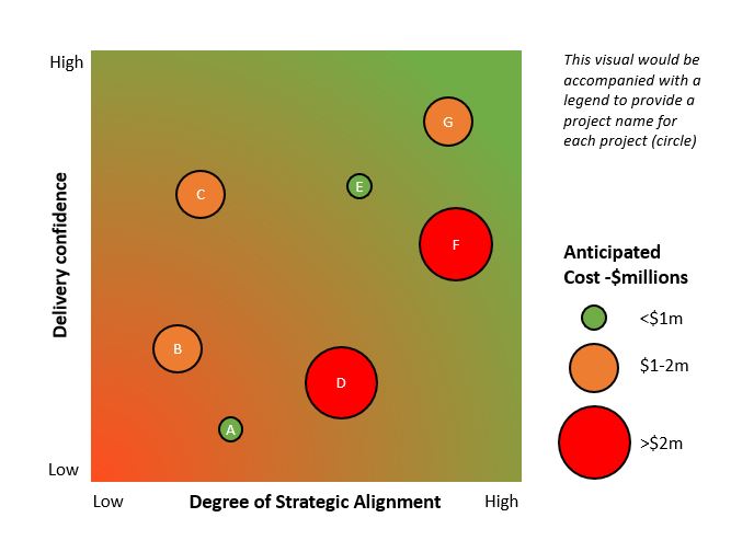
The simple portfolio map (Figure 5.6) above uses circles of various sizes to indicate anticipated cost of each project. A larger circle indicates a greater cost, a smaller circle a lesser cost. Traffic light colours are also used to differentiate between projects of greater cost (red), moderate cost (orange) and lesser cost (green).
5.4 Text and typography
The visuals you create for project work will still incorporate text. The term typography describes the use of text in design. It’s concerned with font types, size and arrangement. Preserving legibility at all costs is critical when using text. Choose fonts that are easily readable, are of a professional style and do not distract from the message. Ensure the font size is large enough to read – less than 10pt is likely to draw criticism, while less than 8pt is no longer legible (Adams et al., 2012). A visual will not normally benefit from the use of more than two or three different types of fonts. For example, a font for decorative/title elements, a font for headings and then a font for content. Where emphasis is required for a string of text, choose bolding, italicisation or a different colour, rather than capitals or underlining (Adams et al., 2012). Use text effects such as shadows sparingly as they can unnecessarily complicate the visual without assisting in the creation of meaning (Adams et al., 2012). If the organisation has a style/communication guide which includes recommended fonts these may be an appropriate choice for the visual.
Concept exploration 5.2: Font resources
There are a number of freely available tools and resources on the internet that can assist you in matching fonts. For example, this blog post by Canva discusses font pairing for headings and body text. Visme has published a similar post designed to help you build your skills in pairing fonts. FontJoy is an interactive tool that enables you to experiment with different pairs of fonts. Take a look at these sites and bookmark them in your internet browser for future reference.
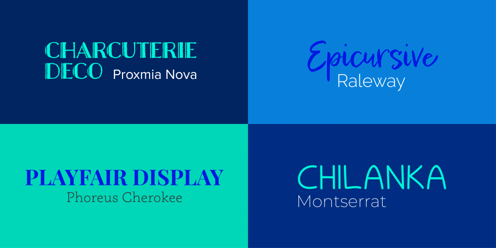
Select a font palette of two or three font choices for the visual at the commencement of the design process. This will avoid unnecessary rework as a decision to change the font later in the design process – even if the size of the font remains the same – can affect the space the text occupies and adversely impact what has been designed. Try to maintain consistent paragraph alignment for similar text elements (Adams et al., 2012). For example, if your visual contains three small paragraphs of text, justify all of them rather than mixing alignment types. Wherever possible avoid hyphens and conform to the contemporary norm of a single (not double) space after a full stop (Adams et al., 2012).
5.5 Common charts and graphs
The archetypes provided in Part C are full-page examples of visuals for conveying different types of information relevant to project work. Many of these archetypes include miniature versions of common graphs and charts. Table 5.1 suggests common charts and graphs that can be useful for presenting types of data. When creating these ‘mini-graphics’ the suggestions regarding colour, scale etc. still apply.
In Table 5.1 below, you can click on the blue buttons next to the name of the chart or graph to see a stylised example.
Table 5.1: Common charts and graphs
5.6 A word of caution…
While arguably more universal than written and verbal language, visual language is not contextless. Our interpretation of visuals will be influenced by our professional or discipline backgrounds, our nationalities or cultures, and our previous experiences with visuals – we interpret visuals within our existing frames of reference, which vary from person to person (Avgerinou & Pettersson, 2011; Griffin & Takakuwa, 1995). The discussion of visual elements above is based on the assumption that the stakeholder comes from a Western culture and has participated in corporate life. When working with stakeholders outside this context it’s important to consider and account for differences in understanding. Iconography and colour are good examples of this. Studies reveal that where iconography is abstract – rather than literally representative of what the icons mean – it is culturally dependent (Griffin & Takakuwa, 1995). Similarly, there can be significant differences in the interpretation of colour dependent on culture (Adams et al., 2012; Jonauskaite et al., 2019; Ou et al., 2004). See Table 5.2 for the diverse associations of the colour red depending on culture.
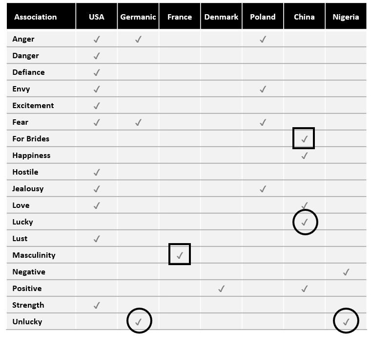
Table 5.2 has been adapted from Aslam (2006) and reveals that the colour red is associated with different interpretations depending on culture. The square and circle annotations highlight that in some cases the interpretations of reds can be considered opposites. For example, red is a masculine in France versus a bridal colour in China (square annotations). In China red is a lucky colour but in Germanic countries and Nigeria it is considered unlucky (circular annotation).
 Chapter 5 summary
- Visual elements such as icons, layout and colour are a visual vocabulary that can be used to create meaning
- Visual language, while more universal than written and verbal language, is interpreted from a stakeholder’s frame of reference – e.g. culture, discipline/professional knowledge, previous use of visuals
- Design choices should support readability and the efficient interpretation of meaning – avoid trying to convey too much information in a single visual, using small font sizes and icons, and unnecessary decorative elements
- Less is more – particularly in terms of colour and font types
- Be mindful of common norms such as time flowing from left to right, and size inferring relative importance
 Recommended readings
Graphic design basics
- Adams, S., Dawson, P., Foster, J., & Seddon, T. (2012). Thou shall not use Comic Sans: 365 graphic design commandments. University of NSW Press.
Cross-cultural considerations
- Griffin, R. E., & Takakuwa, Y. (1995). Using symbols in international business presentations: How well are they understood? International Visual Literacy Association. https://eric.ed.gov/?id=ED380079
Media attributions
Figure 5.5 Monochrome bouba and kiki by Andrew Dunn used under a CC BY-SA licence.
Table 5.2 are from the Noun Project, and licensed under a Creative Commons Attribution licence.
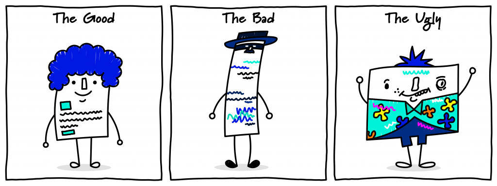
Cartoon: designed by Samara Hoffmann licensed under a CC-BY-NC-SA licence.
