4. Tools for creating visuals
Many project managers believe they lack easy access to the right software for creating effective visuals. However, this chapter will show that in most cases they already have access to the appropriate tools to create visuals similar to the examples in Part C. Instead, the key to success is often building confidence in their design skills by practising the processes and principles outlined in Chapter 5 and Chapter 6. Table 4.1 summarises the advantages and disadvantages of the software packages discussed in the first part of this chapter. The second part of this chapter introduces supporting tools that can bring efficiency and a professional style to your visuals.
This chapter doesn’t address the growing number of tools available for big data visualisation or those that are particularly well-suited to quantitative data analysis (e.g. Microsoft Power BI, Jira, and even Microsoft Project or Excel – a quick web search will provide further information on such tools). If your organisation affords you access to such tools, these can be invaluable for presenting information that has already been captured in an information system, particularly in terms of portfolio management, or in the case of Jira for agile project teams. Commonly, they also have interactivity embedded within them that can quickly show different views of the data. However, as this chapter, in conjunction with Chapter 5 and Chapter 6 outlines, even if you do not have such sophisticated information systems and reporting tools, you can still generate visuals that will have influence.

4.1 Software for creating visuals
Microsoft PowerPoint
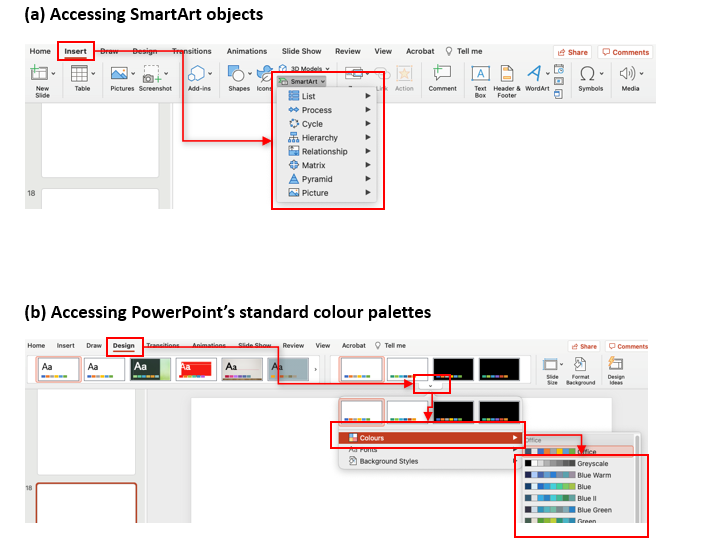
Microsoft PowerPoint – or similar packages such as Google Slides – can be an effective tool for designing visuals. Many project managers already have some skills in these presentation packages which eases the learning curve. Such software also increasingly includes functionality such as SmartArt, which enables the rapid creation of mini-graphics for inclusion in your visuals (refer to Figure 4.1 (a)). If such software is included in an organisation’s standard software suite, there are no additional costs or software deployment time frames. If PowerPoint is part of the organisation’s standard software it also enables the editable version of visuals to be easily shared throughout the organisation (if required).
Presentation packages provide sufficient flexibility for the vast majority of project visuals. The visuals in Part C of this book were created with only Microsoft Office – primarily PowerPoint.
However, care must be taken to adhere to the principles outlined in Chapter 5 and to leverage tools such as the application’s embedded colour palettes (refer to Figure 4.1 (b)). Otherwise, this flexibility can result in visuals that lack a professional presentation and consistent visual style. While these presentation packages are easy to use, it may take more time to achieve a professional look than with some of the infographic packages available online.
Adobe Creative Cloud
Graphic design packages targeted at designers and media specialists like Adobe Creative Cloud can also be used to create project visuals. These suites offer maximum flexibility and artistry but require some training – or existing graphic design experience – to build confidence in effectively and efficiently creating visuals that have a professional appearance. In many organisations, access to these packages will require a special software request and/or additional cost. Even if you can gain access, this could limit the sharing of editable versions of the visual among colleagues, who may lack the skills to use the software themselves. Unless you already have skills in these packages or have a keen desire to build your graphic design capabilities, Microsoft PowerPoint or its equivalent are recommended as a starting point.
Infographic packages
There are an increasing number of web applications that support visualisation capability. These web applications (refer to Concept exploration 4.1 for examples) have both advantages and disadvantages compared to Microsoft PowerPoint and Adobe Creative Cloud. Their greatest strength is that they’re easy to use, offering a relatively quick learning curve. Infographic packages also commonly have templates which help in achieving a professional and consistent look with minimal effort. However, these structuring and styling features also limit the flexibility of the visual’s design. You may find it difficult to replicate some of the archetypes in Part C of this book (or other custom designs) in such web applications. However, if you are building something from scratch, particularly if it is primarily using quantitative data these can be a time-efficient tool to generate visuals that have a professional appearance.
Additional limitations to consider include cost-effectiveness, collaboration potential and data security. For applications offering tiered plans, you may also need to consider the range of features that can be accessed at each subscription level. It’s common for a free version of a web application to limit features and/or the number of visuals you can create. Generally, these limits are progressively removed as the subscription (fee) level increases. Always check the print/export capabilities of the web application before commencing work on your visual. Make sure you can print/export the visual in the format you require and at an appropriate resolution. It’s also common that you will require a paid subscription to access collaboration tools. As such, if budget constraints are an issue and you require others to be able to edit your visual, you may prefer to use an application which is already used across your organisation. Depending on the nature of the visual, the data it contains may be sensitive. If this is the case, ensure you are aware of your organisation’s data storage/protection requirements and that the web application aligns with these needs. Also be aware of whether the level of subscription you are using makes your visual public – in most cases you will want to ensure the privacy of your work and may need to review and adjust your account settings.
![]() 4.1 Concept exploration: online infographic packages
4.1 Concept exploration: online infographic packages
There are an increasing number of web applications that are designed to enable the rapid creation of visuals – see the table below for example web applications with weblinks and introductory videos. These applications are constantly evolving, therefore it’s necessary to review and evaluate their functionality and any associated subscription fee at the time you’re planning to use them. You can complement your own evaluation of their suitability with a web search for reviews on the web application. Always make sure to check the privacy settings for your work and ensure that you are comfortable with the web application’s data storage protocols. Click on the drop-downs below to access the relevant websites and introductory videos of these web applications.
4.2 Software to support the design process
Support your learning curve with Google
Irrespective of your chosen software package, web resources like YouTube are an invaluable source of learning to build software skills. A quick Google search on a software problem you’re facing will normally return a multitude of text and video-based resources. For example, if you’re new to using the hierarchy SmartArt mini-graphic in PowerPoint, simply type “SmartArt” AND “hierarchy” AND “powerpoint” into your preferred search engine and you’ll receive numerous sets of instructions on using this feature. Similarly, if you’re unsure how to change the page layout from landscape to portrait, search “change page orientation” AND “powerpoint”. You can also filter your search results to “video” if you prefer this way of learning. For those requiring more comprehensive skills development, try using the many getting started resources that are also freely available online. For example, search “powerpoint” AND “getting started”.
The power of a Google search
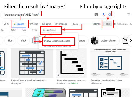
A Google search is also a great source of inspiration for visuals and for mini-images or icons. For example, perhaps you’re looking for a schedule that is different to the samples presented in Part C of this book. Search “project schedule” AND “infographic”, and then filter the search to “images”. A similar approach can be used if you’re looking for an icon. For example, search “project schedule” AND “icon” and filter by “images”. If you’re planning to include the icon in your graphic, choose an icon that has appropriate permissions – for example, Creative Commons – by filtering on “usage rights” (refer to Figure 4.2). If you need to overlay the icon on a coloured background, also filter on ‘transparent’ under the colour menu to enable the background colour of your visual to be visible when you overlay the icon. Select the preferred icon or image and save this as an image file for inclusion in your visual.
Design tools
In Chapter 5, the use of iconography and colour are discussed. Below are two examples of tools that can support the effective use of these elements in visuals. If you are creating a large number of visuals you may choose to subscribe to an icon library like the Noun Project. These online libraries provide a catalogue of searchable icons which can make finding good quality icons fast and easy. Some catalogues – including the Noun Project – also enable you to rotate, flip or change the colour of icons before you download them.
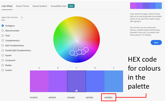
Adobe Color is a free online tool that can support selection and use of colour. This tool enables you to nominate a colour and then explore harmonious colour palettes – for example, analogous, monochromatic, triad or complementary. This tool also has a searchable library of colour palettes if you’re seeking inspiration. If you find a colour palette you would like to use, note the HEX code (the number starting with a #) of each colour in the palette and then add each of these colours into the software package in which you are developing the visual (refer to Concept exploration 4.2 for more detailed instructions). A similar process can be used to add your organisation’s corporate colour palette (refer to Chapter 5 for more information) into your preferred software package for inclusion in a visual.
![]() 4.2 Concept exploration: setting up a colour palette
4.2 Concept exploration: setting up a colour palette
Build your skills in using Adobe Color by watching these short segments from this Adobe Color introductory video:
- Using the colour wheel to create harmonious palettes (03:34–05:00)
- Creating a palette from an image (05:00–06:23)
- Exploring colour themes (07:29–08:40)
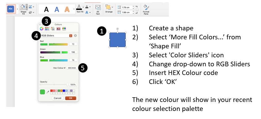
You don’t need to be using the Adobe Creative Cloud suite to explore Adobe Color palettes. Simply note the HEX code (refer to Figure 4.3 (a)) and add this as a colour(s) in the application you’re using to develop the visual (for example, Figure 4.3 (b)).
![]() Chapter 4 summary
Chapter 4 summary
- Software is only one component of successfully designing visuals for project work – refer to Chapter 5 and Chapter 6 for further information on stylistic considerations and the design process
- There are a number of software applications available which can support the creation of visuals
- Microsoft PowerPoint – which is easily available in many organisations – is suitable for creating visuals similar to those in Part C of this book
- Seek the advice of your ICT team before using web applications – particularly in terms of data security, privacy and subscription costs
- Google search functionality can assist you in finding inspiration for your visuals and sourcing icons
- There are web tools such as the Noun Project and Adobe Color which can enhance the professional styling of your visuals
![]() Recommended reading
Recommended reading
Using Microsoft PowerPoint
- Lacher, M. (2019). Business computers 365. Minnesota Libraries Publishing Project. https://mlpp.pressbooks.pub/businesscomputers2019/ [Sections: PowerPoint Chapter 1].
Media attributions
Table 4.1 Thumb icons by Starter Icons Collection from the Noun Project used under CC0 licence.
Figure 4.3(a) Adobe product box shot reprinted with permission from Adobe as per their terms and conditions.
Cartoon: designed by Samara Hoffmann licensed under a CC-BY-NC-SA licence.
