6. The design process
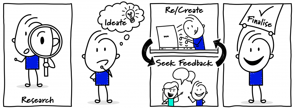
This chapter steps you through the process of designing visuals. A blank page can be intimidating, but coupling the suggestions in this chapter with the visual language elements in Chapter 5 will give you a starting point for developing effective visuals to help you engage and influence your stakeholders. Whether you want to mobilise your project team to progress a key deliverable, seek a decision from the project board or report to a risk committee on an emerging threat, the process below provides a framework for developing an effective visual.
6.1 The design process
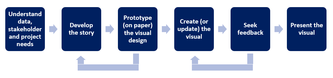
Designing visuals is a type of problem solving. The process involves analysing and understanding your data, and planning and organising this in a manner which supports stakeholder understanding (Collins et al., 2015; Poulin, 2011). The problem at hand is to reconcile multiple elements (illustrated in Figure 6.1) to effectively present your story, build understanding, and likely trigger some for of decision or action. The process used to create visuals varies, but a common approach is shown in Figure 6.2. The key elements of this process are elaborated upon below.
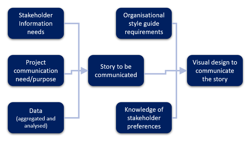
We communicate to achieve a particular purpose (Adams et al., 2012). Before commencing your visual be clear about this purpose – what is it you want to achieve from the communication (Mizrahi, 2015; Snyder, 2014). Do you need to forewarn a stakeholder about a risk or are you seeking a decision? The purpose will shape the visual’s content and design. At the same time, consider the audience (Mizrahi, 2015). For example, is the stakeholder interested in the topic? Do they have any pre-existing attitudes towards the content? Will they devote considerable time to engaging with the visual? Do they contain expert knowledge already or will you need to provide this detail for the visual to achieve the desired outcome? As discussed in Chapter 5, it’s also necessary to consider stakeholders’ ‘frame of reference’ in terms of visual norms. The primary assumption in this book is that the visuals will be supported with some form of explanation/context. However, this may not be the case and will also influence the design choices.
As an example of the need to take the communication’s purpose and the stakeholders into account a visualised timeline used by a project team to manage work on a daily basis will have significantly more detail than a high-level schedule for the project board’s ‘noting’. Similarly, if presenting an options analysis to stakeholders who are technical experts they likely expect different information to a board who have trusted that experts have already been consulted in preparing the options. A project executive working in an organisation with a low-risk appetite may want to review all risks every reporting period, however, a project executive with a higher risk tolerance may only want to review risks that breach organisational tolerances. Developing an awareness of stakeholders’ information needs and preferences can be difficult at first but generally builds with experience (van der Hoorn, 2020).
Collecting accurate and current data is often a challenge in itself. However, it’s almost impossible to commence designing without it, so ensure you allow enough time before you are required to share the visual to elicit or retrieve the required data and resolve any discrepancies. Ask questions of the data custodians to ensure you understand the data and are aware of any limitations or caveats you may need to add as a note to the visual. It may also be necessary to aggregate or analyse multiple sources of data to understand the situation you’re presenting. Together, your understanding of your purpose, the stakeholders and the data will inform how you ‘tell the story’ visually.
When creating the story, it may be necessary to break it down into more than one visual. A common criticism of visuals is that they try to communicate too much and the potential benefits of using visuals are then compromised. Perhaps the story has three ‘chapters’ which may require three visuals. It’s better to maintain the effectiveness of the visual and create more than one, than to overload your visual with data and diminish its usability.
As with text-based communication, creating a story from data is not a neutral act. There are ethical considerations and obligations – for example, it’s crucial to consider how others may be influenced by the way the data is presented. It’s not possible to be neutral, but it is possible to disclose the perspective you’re adopting in presenting a visual or any underlying assumptions. Even the choice of criteria to assess options (for example in Archetype 1 in Part C) has ethical implications. The inclusion or exclusion of certain criteria could sway stakeholders’ perception of the options being presented. Ensuring (as much as possible) that accurate data underpins the visual is the responsibility of the designer. As Edward Tufte so eloquently describes:
‘Making an evidence presentation is a moral act as well as an intellectual activity. To maintain standards of quality, relevance and integrity for evidence, consumers of presentations should insist that presenters be held intellectually and ethically responsible for what they show and tell’ (Tufte, 2006, p. 9).
When designing visuals, you will also need to consider the organisation’s communication style and brand guides. Some organisations will have requirements regarding typography, use of colour, use of corporate logos, even margin sizes. These may be accessed through a communications team or through an intranet or SharePoint site. It’s important to familiarise yourself with these before crafting your visual, otherwise, you may end up needing to recreate elements. It can be beneficial to set up visual templates with headers and footers that align with any style or communication requirements. Over time, you may also become aware of implicit preferences of key stakeholders that you choose to incorporate into your visuals.
Once you have your data, know the story you want to convey, and any requirements for organisational style, start to consider the layout of the visual. The archetypes in Part C of this book have been designed to provide you with inspiration for presenting different types of data related to project work. However, you can also source inspiration from Google image searches and volumes on graphic design (Adams et al., 2012). As you build you visual practice, take notice of effective visuals that you encounter in daily life (Poulin, 2011). You may take photos and save files for inspiration. While it’s beyond the scope of this book to provide detailed advice on copyright laws – which vary between countries – there is a difference between using others’ work for inspiration, and plagiarism. Be mindful of your responsibilities to acknowledge the work of others and avoid copyright infringements.
Chapter 5 provided guidelines for creating effective visuals. There may be times when you deliberately choose to go against these recommendations. If this is the case, do so cautiously and with good reason and make allowances for the implications of having done so. For example, if you choose to use the traffic light colours in a manner contrary to common understanding, ensure you provide a legend and this difference in their use is unmistakably clear. Use of a legend even if you’re confirming with expected norms, is good practice, but you can generally be more subtle in their placement! Notes and contextual information can also be used to ensure that readers interpret the visual as intended.
Particularly if you are new to designing visuals, start with pen and paper (or whiteboard) first, before creating the visual in a software package. An A3 sketchpad and pack of felt pens can be a useful tool in addition to the software described in Chapter 4. Start by considering the main elements of your visual and how you may lay them out on the page (see Figure 6.3 for an example). This process will provide a sense of the amount of space (or ‘real estate’) you can afford to allocate to the various components and may reveal you’re trying to communicate too much in a single visual. Try different ideas and particularly in these initial stages be open to starting again. When prototyping, it’s common to become aware of an issue which prompts you to further refine the story for clarity. Once you’re reasonably confidence that the design will be achievable on the page, recreate and populate your visual in your chosen software package.
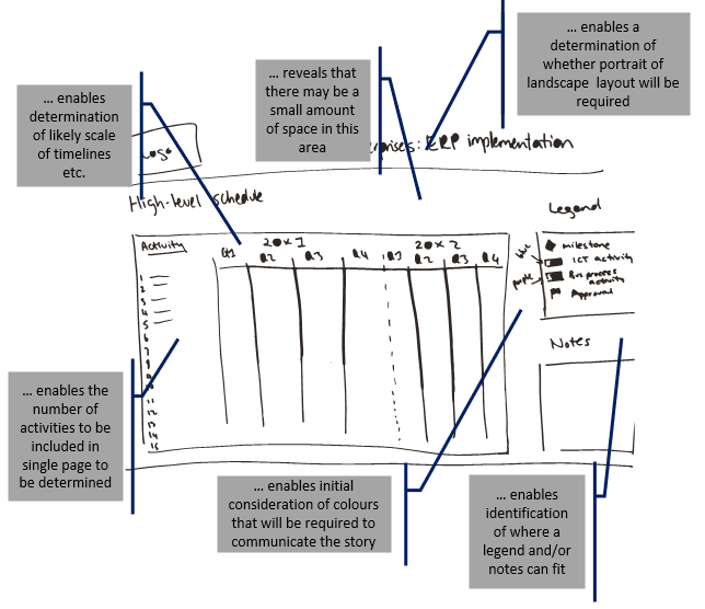
Creating a prototype on paper or on a whiteboard provides an indication of what can be achieved within the constraints of the size of the page, and also provokes consideration of other elements such as the colour palette and any iconography.
Sometimes a project visual will become an ongoing communication tool, for example, dashboard reports or schedules. Design these visuals with scalability and updatability front of mind. For example, if the graphic includes a risk grid similar to that in Archetype 3, Example B, ensure that it’s large enough to represent the number of risks you may want to include in any given update, not just what’s known at the point of initial design. Visuals are more effective when the style and visual language used are familiar to stakeholders (van der Hoorn, 2020). Wherever possible, avoid changing the design and language of visuals that serve the same purpose without good reason. For example, don’t use a different style of dashboard each month. If you find many initiatives within your organisation are using the same visual and the data is already being captured in a central database, it might be beneficial to request a custom report for generating the data from the available datasets.
As you start developing the visual in the software package, seek regular feedback from peers and if possible, the intended audience. Particularly, when you’re first starting out, check understanding of your work by seeking a second or third opinion. Also remember that simpler is often best. Sometimes after sharing a draft with a peer or stakeholder it becomes apparent that certain information is not necessary for the purposes of the story at hand and the visual can be simplified. This review and updating process is an essential step before the formal presentation or sharing of the visual. When presenting visuals to stakeholders, consider their feedback as a way to develop a better understanding of key stakeholder needs which can inform the design of future visuals (see, for example, Killen, 2022 for more information on the importance of understanding stakeholder information needs).
6.2 Visual housekeeping and file conventions
As with any document there are ‘housekeeping’ – predominately ‘configuration’ management – issues to be considered. Similar to a text-based document, headers and footers are a useful inclusion for a visual. In the headers and footers, include the version number of the visual, the page number if the visual has multiple pages, and the date of the version. You may also choose to include the version number in the file name. It is often appropriate to include the project or initiative or company name in the header or footer. If the visual is in draft it can be useful to include this as a watermark – assuming it doesn’t obscure the content – or include this in a header or footer to ensure stakeholders appreciate that it isn’t the final or approved version.
Visuals can be created and shared in a number of file formats. The software application used to create the visual will determine the ‘editable’ file format. For example, Microsoft PowerPoint files usually have the extension .ppt, while Adobe Illustrator files will likely have the extension .ai. These editable formats will generally be of a larger size than the file formats that are used for sharing the visual. Common formats for distributing visuals via email, which prevent the recipient easily editing the visual, and do not rely on specialist software include PDFs, JPEGs or PNGs (refer to Concept exploration 6.1 for more information on file types). Since these files are often smaller (and therefore more suitable for emailing), you’ll need to be aware of poor resolution. As the file size is reduced, this can impact readability. If your visual is being professionally printed you may be asked to provide the file in a format such as EPS. If you anticipate this professional printing requirement, consult with the print team before commencing work to ensure that your software package can create the visual in a format – and at a resolution – that meets print quality expectations.
![]() 6.1 Concept exploration
6.1 Concept exploration
Selecting the appropriate file format for sharing your visual contributes to its effectiveness. Key considerations are:
- File size: If the file is too large, it may cause issues with sending and opening emails
- Resolution: If an image’s resolution is poor it can become illegible and appear unprofessional
- Software required to open the file: Avoid sending stakeholders files they can’t easily open
Appreciating the benefits of PNG versus PDF can help you choose the right file type for distributing your visual in a non-editable format:
- PNG: Best used if the recipient needs to insert the image into another image or document because PNGs allow for a transparent background
- PDF: Best used if stakeholders are likely to print the visual
For more information on file types and their advantages and disadvantages check-out this blog post by HubSpot.
![]() Chapter 6 summary
Chapter 6 summary
- Accurate data is essential – ensure you allow time in your planning to elicit and gather data and clarify any discrepancies
- Take the time to find the story in the data that is relevant for your purposes and the needs of your stakeholders – remember your ethical obligations
- Start designing on paper (or a whiteboard) first to determine the overall layout of the visual
- Seek feedback early and regularly to ensure the meaning is clear to your intended audience
- Use headers and footers to capture information such as version number and status (draft, etc.)
- Select file formats carefully – you’ll need to balance quality of resolution (clarity of image) and file size
![]() Recommended readings
Recommended readings
The design process
- Collins, W., Haas, A., Jeffrey, K., Martin, A., Medeiros, R., & Tomljanovic, S. (2015). Graphic design and print production fundamentals. BCcampus Open Education. https://open.umn.edu/opentextbooks/textbooks/graphic-design-and-print-production-fundamentals [Sections 2.1, 2.2, 2.5]. Note: This resource is about graphic design generally rather than in the context of internal/stakeholder communications related to projects
Copyright
Media attributions
6.1 Concept exploration image: Image by evrywheremedia from Pixabay used under CC0 licence.
Cartoon: designed by Samara Hoffmann licensed under a CC-BY-NC-SA licence.
Please note: The quotation in this chapter from Tufte (2006) is reproduced with permission from the copyright holder. No further reproduction of this quotation is permitted without prior permission from the copyright holder.
