Archetype 9: Hierarchy of items
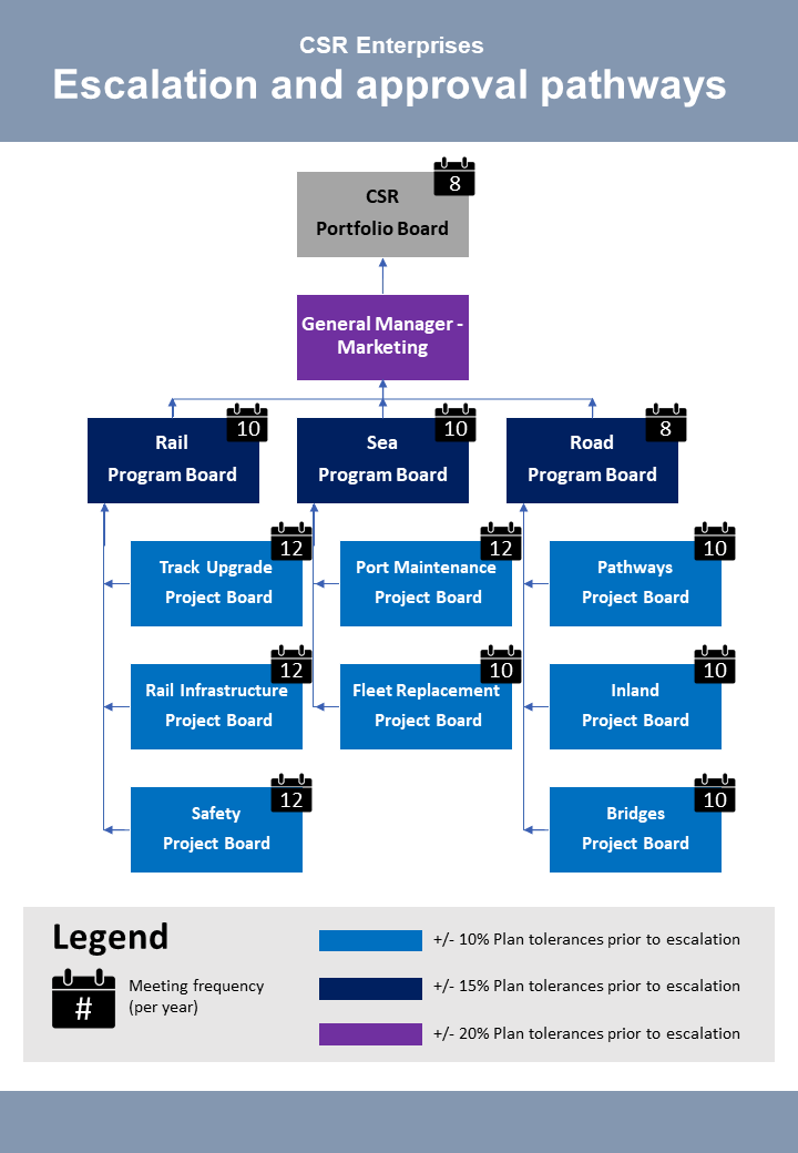
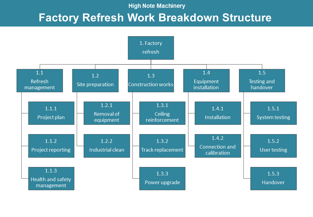
This archetype is used to communicate how something is broken down into smaller and smaller parts. The editable PowerPoint files for the examples of this archetype are provided at the end of this chapter for you to use and adapt, along with annotated versions of the archetypes to show the key elements in their design.
Example A: Hierarchy of items

Example B: Hierarchy of items

Guidelines for tailoring the archetype
| Archetype | Hierarchy of items |
|---|---|
| Purpose | This visual archetype is to communicate how something is broken down into smaller and smaller parts. This may include: • organisations (as in an organisational chart of staff roles) • scope of a project (as in a work breakdown structure) • issues or risks (similar to root cause analysis) |
| Information you will need | • The components in the hierarchy • The groups of these components/how they are related |
| Tips | • You can annotate features/characteristics of the components using icons (use a legend to explain the icons) • Microsoft Office SmartArt has a variety of adaptable hierarchy options otherwise these can be created through lines and rectangles (or another shape) • You may choose to add arrows to show the direction of the ‘flow’ |
| Page layout | • Landscape will be most suitable if you have a larger number of high-level groupings than sub-components • Portrait will be most suitable if you have a larger number of sub-components than high-level groupings |
| Text | • Each component and group of components will require a label |
| Imagery | • Each component and group of components will be a shape - for example, a rectangle • Connect the shapes to show their relationship using straight lines (arrows are not recommended unless there is a definite flow) |
| Colour | • There is no specific use of colour for this archetype • Often a single colour will be appropriate for all shapes • You can also use a different colour for different groups of components |
| Legend | Use a legend for: • explaining the colour used to represent the different groups • any icons/annotations you might use on the diagram to show features about the components or groups |
| Notes | • If there is one component in the hierarchy that you want to breakdown further but this further breakdown is not applicable to all components, consider creating a second diagram and using an annotation/note to link the diagram |
Example A: Hierarchy of items (with annotations)
Click the blue information buttons on the diagram below to see annotations explaining the reasons for choosing these visual elements.
Example B: Hierarchy of items (with annotations)
Click the blue information buttons on the diagram below to see annotations explaining the reasons for choosing these visual elements.
‘Hierarchy of items’ templates
The templates shown above are freely available for you to use and adapt. You can download them using the links below:

