Archetype 3: Variable-based comparison
This archetype is used to communicate the differences between concepts. The editable PowerPoint files for the examples of this archetype are provided at the end of this chapter for you to use and adapt, along with annotated versions of the archetypes to show the key elements in their design.
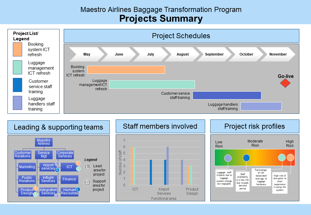
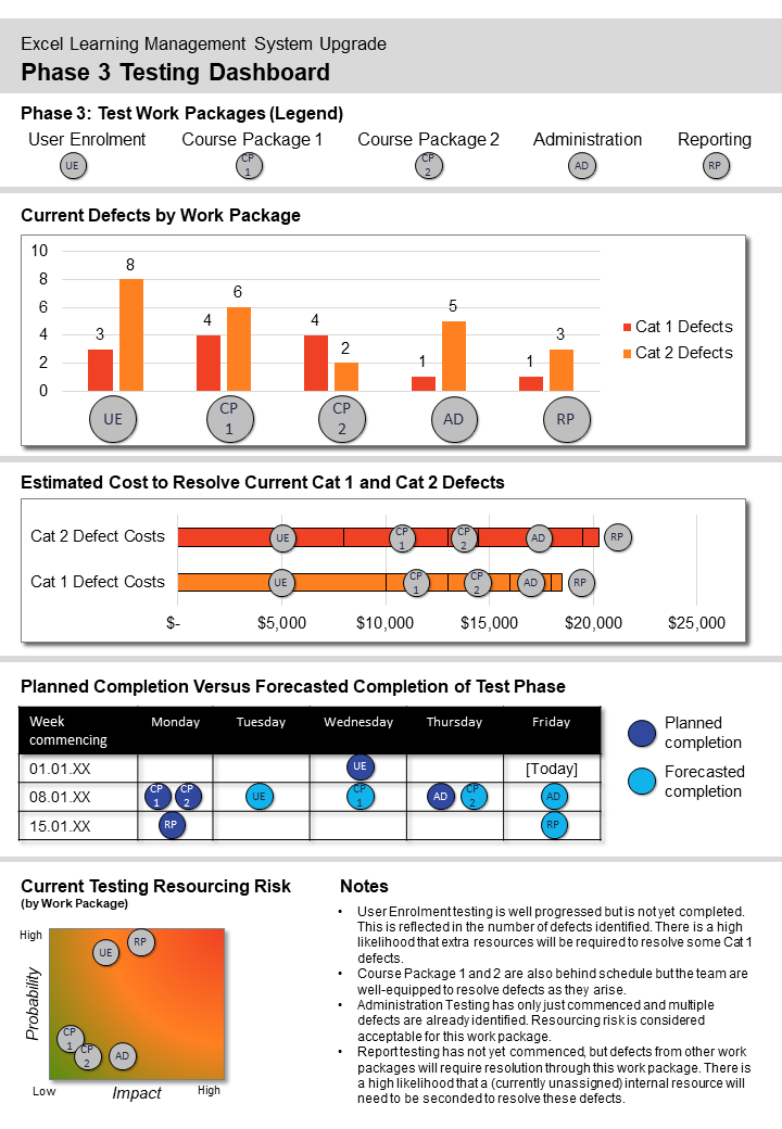
Example A: Variable-based comparison
Example B: Variable-based comparison
Guidelines for tailoring the archetype
| Archetype | Variable-based comparison |
|---|---|
| Purpose | This visual archetype is used to communicate the differences between concepts (e.g. initiatives, work packages). This may include: • differences across initiatives • differences in work packages/activities • comparison of work units/areas There are similarities in this archetype to the comparison between options but this archetype is less directed at enabling a decision to be made about an option. It does not highlight that one concept is better than another. It also brings into focus the criterion being compared and maps the options/concepts on these elements. |
| Information you will need | • What are the concepts (e.g. initiatives or work units)? • What are the criterion (variables) you are using to compare? • The value of the criteria (variable) for each concept |
| Tips | • Try to compare a medium number of concepts: 5 > 6 is best (up to 8 is possible) • Try to compare a medium number of criteria/variables 3 > 5 is best |
| Page layout | • Either landscape or portrait is possible • Best choice will depend on the criterion and how you are choosing to visually represent these • Split the page into various sections, one for each criterion – these will be a series of mini-graphics • The size and proportions of each section will depend on the type of graphic you will use for each criterion (e.g. schedule/timeline will require a wide area versus a hierarchy which is more likely to require a square area). Refer to different archetypes for ideas on mini versions to use in your comparison. |
| Text | • For each section ensure you use a heading which indicates the criterion • Text can be become small in the mini-graphics so you may limit how many criterion you can show due to font size restrictions • Ensure any axis/labels are provided for each mini-graphic |
| Imagery | Each section will be for a different criterion/variable. For each section use a different mini-graphic. Mini-graphics may include: • mini schedules • mini graphs (pie charts or bar graphs) • hierarchies • spectrums, etc. Keep the mini-graphics as simple as possible. |
| Colour | • Consider using one or two colours for the decorative areas of the page and for the headings for each section • Select a colour or simple icon to represent each concept and use that colour/icon to indicate the concept in each criterion/variable’s mini-graphic |
| Legend | • Consider using an overall legend for the page which shows the colour/icon associated with each concept • You may also need to use other mini legends if there are additional icons for individual mini-graphics - where possible, keep these legends as close as possible to the mini-graphic to which they apply |
| Notes | • This visual is a combination of multiple mini-graphics/archetypes • Microsoft SmartArt and Chart functionality can be a useful way to generate mini-graphics • Connect these mini-graphics through the use of a single colour/icon for each concept |
Example A: Variable-based comparison (with annotations)
Click the blue information buttons on the diagram below to see annotations explaining the reasons for choosing these visual elements.
Example B: Variable-based comparison (with annotations)
Click the blue information buttons on the diagram below to see annotations explaining the reasons for choosing these visual elements.
'Variable-based comparison' templates
The templates shown above are freely available for you to use and adapt. You can download them using the links below:
