3 Using Statistical Analyses
Statistics is the science that deals with the collection, analysis and interpretation of numerical data.
Statistics has entered almost every aspect of human endeavour. We can use it for better planning, more efficient delivery of services and increased productivity. Although statistics is a rewarding career choice, most of us will not specialise in this field.
It is, however, important to improve statistical literacy among scientists, journalists, doctors, patients and the community at large, so we can make informed decisions in the face of uncertainty.
In scientific research, we conduct statistical analyses to help us determine whether datasets are different from each other. When statistical analysis determines that datasets are different, we refer to the datasets as ‘statistically different’, or the difference as ‘statistically significant’ or that there is ‘a significant difference’.
When statistical analysis reveals that datasets are not different, we say that there is ‘no significant difference’ between groups.
In this chapter, we will explain some of the basic statistical analyses student scientists will carry out – many of which were referred to in Chapter 2 when you learned about designing experiments. This chapter also provided instructions for conducting these tests using Microsoft Excel software and the VassarStats website.
3.1 Statistics as a part of everyday life

Cholera map made by John Snow in 1854
The location of reported cases of cholera are shown in Figure 3.1. Presentation of the data collected on the number of cases and where they occurred would have been very useful in understanding the spread of the disease and contributing to prevention.
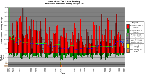
Sporting performance
Figure 3.2 summarises the test bowling statistics of cricketer Imran Khan, showing the number of runs conceded each innings, and career and last 10-innings averages. Collecting so much information in one figure, combining raw data and averages, is a very economical way to summarise a sportsperson’s career.
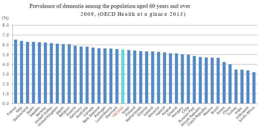
Health of the population
This bar graph shown in Figure 3.3 presents the percentage of the population aged 60 years and over in 41 countries who have dementia . This figure provides the reader with details of the percentage of the population diagnosed with dementia at the same time allowing a comparison of the percentages across a number of countries.
3.2 Setting up Excel for statistical analysis
Use the arrows below to find out how to set up excel for statistical analysis.
3.3 Calculating descriptive statistics using Excel
Descriptive statistics are obtained to provide a simple summary of a dataset. Common summary values obtained are mean = a number that typifies a set of numbers, such as a geometric mean or an arithmetic mean; the average value of a set of numbers, and standard deviation = a statistic used as a measure of the dispersion or variation in a distribution; how much the data points differ from the mean.
Use the arrows below to find out to calculate descriptive statistics using Excel.
3.4 Manually calculating mean and standard deviation in Excel
Use the arrows below to find out to manually calculate mean and standard deviation in Excel.
3.5 The p value
In scientific research, we refer to the p value to determine if there is a statistical difference (significant difference) between datasets.
Traditionally, in scientific research, a p value of less than 0.05 is considered significant (mean values are different). A p value of 0.05 means that there is a 95% likelihood that the difference between the means is because of the experimental conditions and not chance. In other words, there is only a 5% likelihood that the difference between the means is because of chance, and not the treatment.
One- and two-tailed tests
When you conduct statistical tests using Excel (and most other statistics software) you will see in the outputs that there are two p values, one for a one-tail test, and the other for a two-tail test; the values will be different.
A two-tailed test, also known as a non-directional hypothesis, is the standard test of significance to determine if there is a relationship between variables in either direction. A one-tailed test, also known as a directional hypothesis, is a test of significance to determine if there is a relationship between the variables in one direction. A one-tailed test is useful if you have a good idea, usually based on your knowledge of the subject, of the direction of the difference that exists between variables. This makes our statistics more sensitive and able to detect more-subtle differences.
Unless you can justify why you are using a one-tail test, it is recommended that you use a two-tail test.
Video 3.1: p value in statistics [4 mins, 42 secs]
The video below explains what a p value tells us. There are different types of statistical tests used to determine the p value, depending on the type of data you have.
Note: Closed captions are available by selecting the CC button below.
Calculating the p value using an independent t-test in Excel
This statistical hypothesis test is conducted to determine whether there is a statistically significant difference between the means in two unrelated groups (e.g. females and males).
Use the arrows below to find out to calculate the p value using an independent t-test in Excel.
Calculating the p value using a paired t-test in Excel
This statistical hypothesis test is conducted to determine whether there is a statistically significant difference between the means in two related groups (e.g. control and treatment measures in a group of participants in an experiment using a cross-over design).
Use the arrows below to find out to calculate the p value using a paired t-test in Excel.
Calculating the p value using a one-factor analysis of variance (ANOVA)
The one-factor analysis of variance (ANOVA) test is conducted to determine whether there is a statistically significant difference between the means of three or more groups. The groups may be independent or unrelated, or they may be related.
Unrelated groups are made up of separate groups where a given participant will only experience one condition in a control group experimental design (e.g. children, adults and older people).
Related groups are made up of the same participants with each participant experiencing all conditions as would occur in a cross-over experimental design (e.g. placebo, acute low-dose caffeine, acute high-dose caffeine).
In Excel, the same test is used to determine if there are significant differences between groups. It doesn’t matter if the groups are independent or related. (But note that this is not the case with all analytic tools).
Use the arrows below to find out to calculate the p value using a one-factor analysis of variance (ANOVA).
To determine which datasets are statistically different from each other, conduct independent t-tests (using the instructions shown previously) comparing variable 1 and variable 2, variable 2 and variable 3, and variable 1 and variable 3.
This is not the ideal way to conduct a post hoc analysis, but is the simplest way to do this using Excel. We suggest using VassarStats for one-factor ANOVA tests.
3.6 Linear correlation
When do I use a linear correlation?
You may choose to use correlation when you are trying to determine whether, and how strongly, two variables are related (linearly). Correlations are appropriate to use when your data are continuous, which means that the values are not restricted to defined separate values but can be any value across an endless range. Examples of continuous data include temperature in degrees Celsius and height in centimetres. (Note, data should be normally distributed and not contain any significant outliers if you plan to test for correlations; these factors are not addressed in this guide.)
Correlation is a statistical approach to determining if and how well two variables are related to each other.
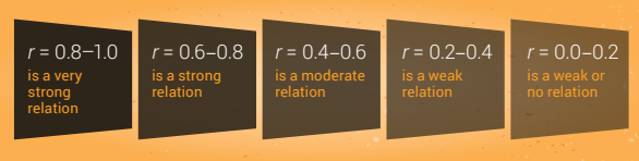
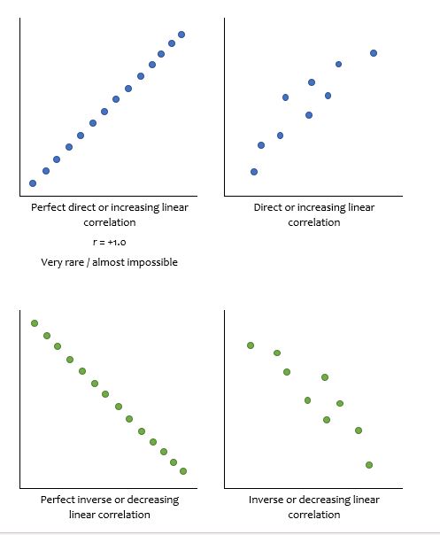
One of the simpler correlations is called Pearson’s product-moment correlation. This test produces a correlation coefficient, r, which is the number that indicates the strength or magnitude, and the direction of the relation between the two variables. The correlation attempts to draw a line of best fit through the data points, and r indicates how far away the data points are from the line. There are different guidelines for interpretation of the strength of the relation – one example is shown in Figure 3.4.
Generally speaking, the more the relation between the two variables looks like a straight line, the closer r gets to 1.0 or –1.0. If r is positive then you have a direct or increasing relation between variables and if r is negative then you have an inverse or decreasing relation between variables.
Remember that correlation does not indicate causation. Finding a correlation between two data points does not mean that one caused the other. Box 3.1 gives a more detailed explanation of this.
Box 3.1: Difference between correlation and causation
A physiological example of the difference between correlation and causes can be seen in heart disease studies.
Correlation studies
There are a lot of epidemiologic studies showing inverse associations between antioxidant intake and the incidence of atherosclerosis. In other words, an inverse correlation exists between antioxidant intake and the incidence of atherosclerosis. Because the epidemiologic data only show a correlation however, it would be incorrect to say that ‘low antioxidant intake causes atherosclerosis’ based on these studies.
Similarly, a number of early studies showed that low concentrations of blood antioxidants were associated with an increased risk of adverse cardiac events. In other words, there was an inverse correlation between blood antioxidants and adverse cardiac events. Because correlation does not indicate causation, the authors of this group of studies could not conclude that low blood antioxidants caused adverse cardiac events, or vice versa.
Cause-and-effect studies
Follow-up studies went further than looking for correlation between these variables. Experiments were designed to determine the effect of antioxidant supplementation on atherosclerosis and adverse cardiac events. To determine cause-and-effect, groups of investigators designed randomised controlled trials (RCTs) where one group of human participants received long-term antioxidant supplementation, and the other group received a placebo.
Overall, these studies have shown conflicting findings, with some studies showing that antioxidant supplementation reduced atherosclerosis and adverse cardiac events, and other studies showed no effect. The exact reasons for the contradictory findings observed in the RCTs are not known, although it has been suggested that differences in the study populations, supplements administered, and outcome measures may explain the variability.
A key point that you should take from this example is that these later experiments were specifically designed to determine if cause-and-effect exists. In this case, it would be incorrect to talk about associations or correlations between antioxidant intake and atherosclerosis and adverse cardiac events.
Case study 3.1: Example of correlation analysis
Wisløff and colleagues investigated whether maximal strength was related to sprint performance in elite male soccer players. The first variable, maximal strength, was the maximum load the participants could lift in half squats (1 repetition maximum, in kilograms). The second variable, sprint performance, was time taken to sprint 10 m (10 m sprint, in seconds). The scatter plot revealed a direct linear relation and this was supported by the correlation coefficient and the p value: r = 0.94, p < 0.001. According to the r value, the direct linear relation was very strong (see images below). The investigators concluded that maximal strength in half squats was associated with sprint performance – participants with high strength ran 10 m faster than participants with low strength.
Testing for a correlation using Excel
We will look at the steps to follow for a correlation using the example of investigating whether time spent exercising per week was associated with performance on physiology exams.
Use the arrows below to test for a correlation in Excel.
Reporting the results of the correlation
If you did not test the significance, then:
r(df) = [Pearson coefficient]
Where df = total number of observations / data points – 1
Using the example above. r(9) = 0.87
If you did test the significance, then:
r(df) = [Pearson coefficient], p = [p value]
Using the example above. r(9) = -0.87, p = 0.001
Excel will not easily test the significance of a correlation; however, if you are using more powerful statistical software (or VassarStats), you will obtain a p value that you can interpret as previously discussed.
When describing and discussing your data, you can refer to the strength of the relation between the variables using the wording shown in Figure 3.4; the direction will be determined by whether r is positive or negative.
In this example:
A very strong direct relation (r=???) was observed between time spent exercising per week and performance on a physiology exam.
Remember, you cannot conclude that long periods of time spent exercising caused high performance on a physiology exam, or vice versa, just that these variables are associated with each other.
3.7 VassarStats
VassarStats is a free web-based program that you can use to conduct statistical analysis. We recommend using this program for one-factor ANOVA, two-factor ANOVA and linear correlations. Unlike Excel, VassarStats allows you to conduct post hoc tests after your ANOVA and to determine the statistical significance of linear correlations. It is a simple to use website that steps you through each phase of the test.
Use VassarStats to calculate ANOVA and linear correlations.
If you use VassarStats to conduct one-factor ANOVA tests, use the following:
- Independent group comparison: One-factor ANOVA Independent Samples test
- Related group comparison: One-factor ANOVA Correlated Samples test.
The designers of this site suggest using the following web browsers – Firefox, Safari, and Chrome. Note that Internet Explorer is not recommended.
Below are instructions for using VassarStats to conduct the following tests:
- One-factor ANOVA Independent Samples
- One-factor ANOVA Correlated Samples
- Linear regression.
Calculating the p value using a one-factor analysis of variance (ANOVA) Independent Samples test
This statistical hypothesis test can be used to determine whether there is a statistically significant difference between the means of three or more groups when the groups are independent or unrelated.
Unrelated groups are made up of separate groups where a given participant will only experience one condition in a control group experimental design – for example, children, adults and older participants.
All screenshots in this section are used with permission from the copyright owner, Richard Lowry.
Use the arrows to learn how to calculate the p value using a one-factor analysis of variance (ANOVA) Independent Samples test.
Calculating the p value using a one-factor analysis of variance (ANOVA) Correlated Samples test
This statistical hypothesis test can be used to determine whether there is a statistically significant difference between the means of three or more groups when the groups are related or made up of the same participants.
Related groups are made up of the same participants, with each participant experiencing all conditions as would occur in a cross-over experimental design – for example, placebo, acute low-dose caffeine, acute high-dose caffeine.
All screenshots in this section are used with permission from the copyright owner, Richard Lowry.
Use the arrows to learn how to calculate the p value using a one-factor analysis of variance (ANOVA) Correlated Samples test.
Testing for a correlation using VassarStats
We will now look at the steps to follow if trying to determine correlation, using the example of investigating whether time spent exercising per week was associated with performance on physiology exams in the section called ‘Testing for a correlation using Excel’.
All screenshots in this section are used with permission from the copyright owner, Richard Lowry.
Use the arrows to learn how test a correlation using VassarStats.
Click the drop down below to review the terms learned from this chapter.
Copyright note: Content from the following source is reproduced with permission from the copyright holder and is excluded from the Creative Commons Licence of this work. No further reproduction of this quotation is permitted without prior permission from the copyright holder.
- VasserStats screenshots by Richard Lowry
