4 Data Visualisation
Now that you are familiar with the scientific method, know how to design experiments, and have collected and analysed the results, what do you do next?
By the time you arrive at this stage, you will know your research project and data inside out. Other than your immediate colleagues, most people will not be as familiar with the work. You know that a part of the scientific process is sharing information.
You will increase the chance of engaging and informing your audience by communicating the findings of your research visually, through figures and tables. Presenting data in figures and tables, rather than in text alone, will help the audience grasp difficult concepts and observe patterns. You saw some good examples of these in Section 3.1.
In this chapter, you will learn how to create column and line graphs (figures) with correct axis titles, error bars, and significance symbols using Microsoft Excel and Word software. You will also learn how to create scientific tables.
4.1 Creating a column graph in Excel
Column or bar graphs are used to show patterns and relationships across and between datasets when the general pattern is more important than the exact data values.
Start by calculating descriptive statistics (mean, standard deviation) using one of the methods shown in Chapter 3.
Use the arrows below to learn how to create a column graph in Excel.
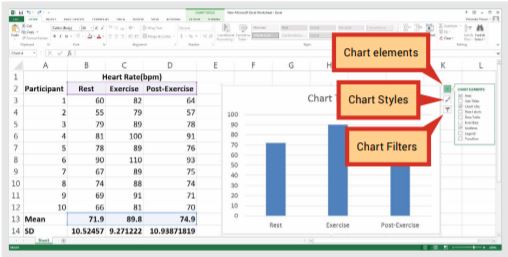
Box 4.1: Using the ‘Charts elements’ feature
You can use this menu to change how your graph looks and what data are displayed.
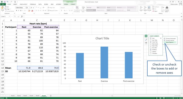
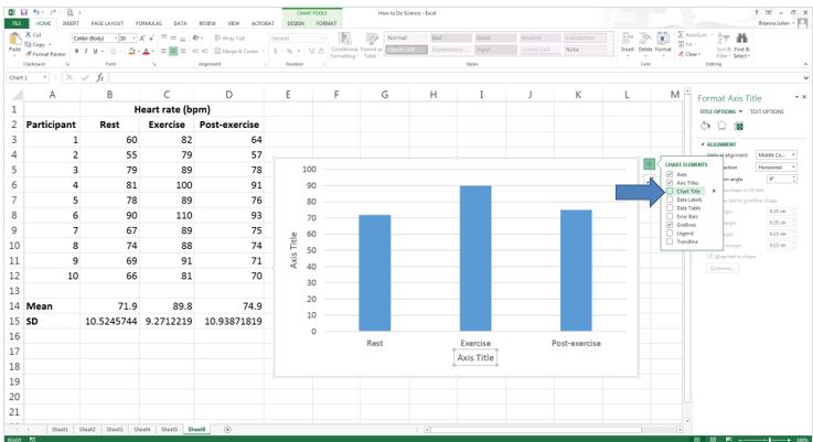
Changing axes and axes titles
If you untick the box next to ‘Axes’, you can remove both the x- and y-axes. If you hover your mouse over the ‘Axes item’, you can access more options for formatting the axes.
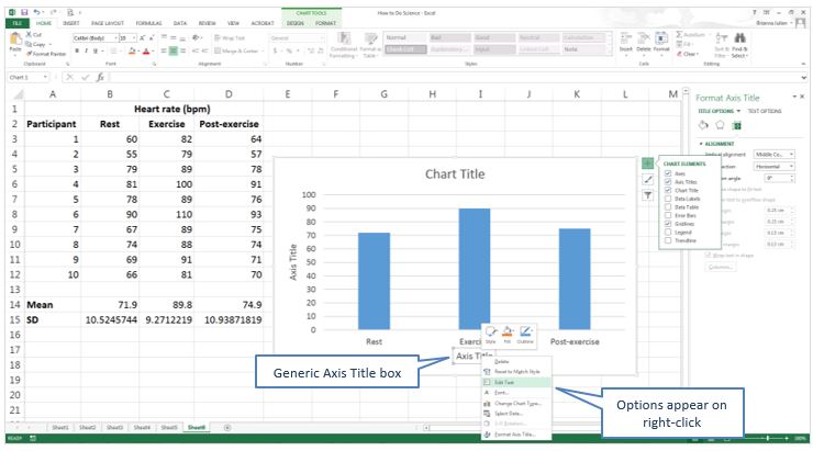
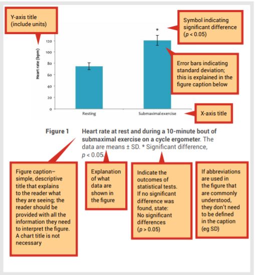
Add axis titles and format the titles. If you selected column headings when creating the graph, each column will already be labelled with that information (rest, exercise and post-exercise in this example).
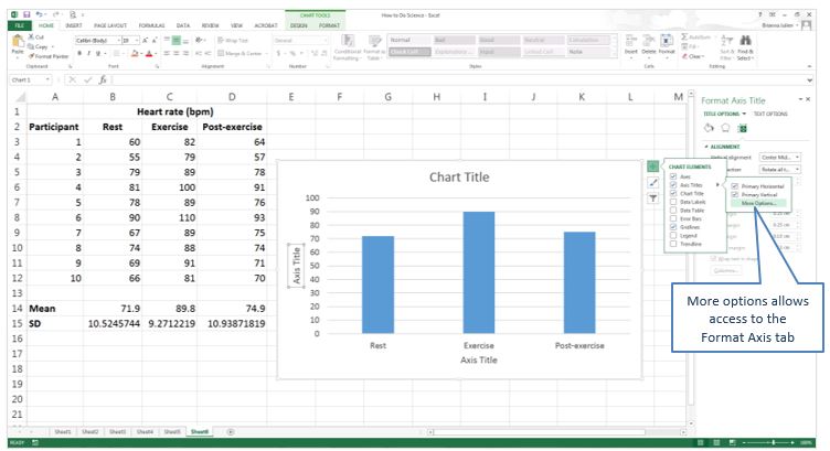
When the ‘Axis Titles’ box is checked, generic axis labels will be added. Right-click on the labels and select ‘Edit Text’ to replace the generic title with your own.
Deleting the chart title
In most cases, you will not need a chart title because this information will be provided in the figure name or caption, so uncheck the box next to ‘Chart Title’.
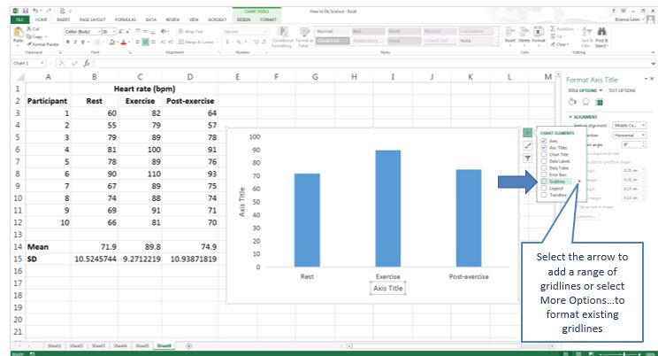
Adding or removing gridlines
Check or uncheck the ‘Gridlines’ box to add or remove gridlines.
Adding error bars
Check the box next to ‘Error Bars’, click on the arrow and select ‘More Options’.
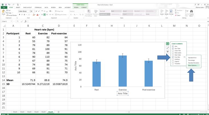
You will now have access to the ‘Error Bars’ formatting tab on the right-hand side of the screen. For ‘Error Amount’, select the ‘Custom’ option and click the ‘Specify Value’ button.
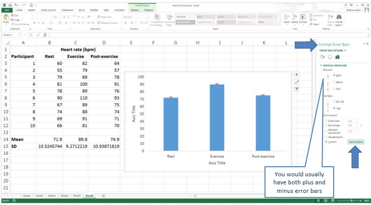
The ‘Custom Error Bars’ dialogue box will appear. This is where you add the cell references for the values to be used for the error bars. When adding both positive and negative error bars, you enter the same cell locations/error bar values to both boxes (cells B15:D15 in this example).
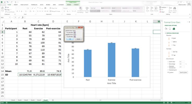
If you get an error message after entering your standard deviation values into the ‘Custom Error Bars’ boxes, check to make sure the text present in these boxes when the window first appeared was deleted completely before you added your values.
Error bars (representing standard deviation) will appear on your graph.
Adding significance symbols
Use the arrows below to learn how to add significant symbols in Excel.
Changing the look of your column graph using ‘Format Data Series’
There are several things you can do to make your graph look more attractive. To access these options in Excel, you need to access the ‘Format Data Series’ tab.
Use the arrows below to learn how to change the look of your column graph.
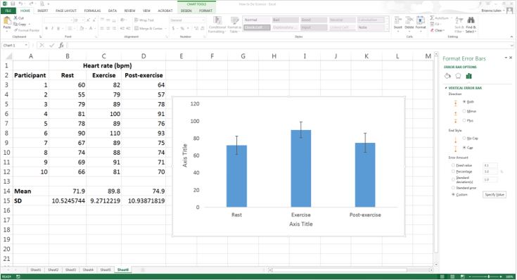
A completed scientific column graph
After following the previous instructions, you will have a completed scientific column graph. Add a figure legend (caption) below the graph and it will be ready to share. The example shown below is for illustration purposes only – usually data this simple would be presented in text with no need for a figure.
4.2 Creating a line graph in Excel
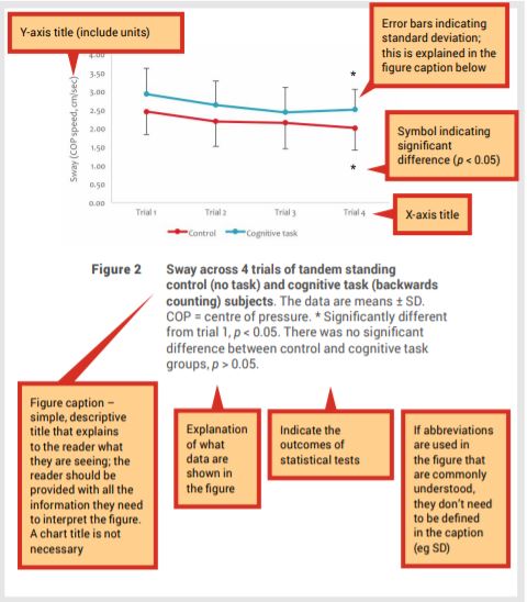
Line graphs are used to show patterns and relationships across and between datasets when the general pattern is more important than the exact data values. Line graphs are particularly useful if you want to show a trend over time occurring in two or more groups.
Most of the principles of creating a line graph are the same as for creating a bar or column graph, so follow the instructions in Section 4.1 when changing axis titles, adding error bars and significance symbols. Formatting specific for line graphs are described in the following steps.
Start by calculating descriptive statistics (mean, standard deviation) using one of the methods shown in Chapter 3.
- Highlight the data you wish to graph.
- Select the ‘Insert’ tab and choose the type of graph you want to create – for example, click the drop-down arrow next to the icon of a line graph and select a line graph style:
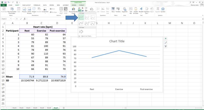
A simple line graph will appear in your spreadsheet and ready for you to format using the same steps shown in Section 4.1.
Adding markers to data points
Select the data in your graph and the ‘Format Data Series’ tab will appear on the right-hand side of your screen.
Click on the ‘Line and Fill’ icon and then the ‘Marker’ label and click the arrow at the side of ‘Marker Options’.
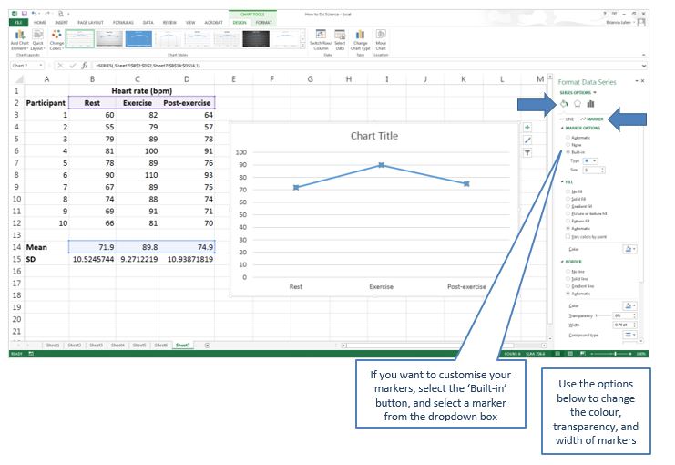
Choose an ‘Automatic’ or ‘Built-in’ marker. You will now have data markers on your line.
A completed scientific line graph
After following the instructions above, you will have a completed scientific line graph. Add a figure name (caption) below the graph and it will be ready to share.
4.3 Creating a table using Word
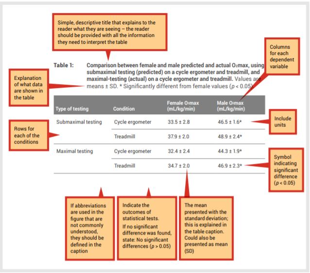
Tables are used to present many precise numerical values and other specific data in a small space and, importantly, when you don’t want to show patterns and relationships across and between datasets.
Start by calculating descriptive statistics (mean, standard deviation) using one of the methods shown in Chapter 3. Note that the screenshots in this section are from Microsoft Office Professional Plus 2013; if you are using a different version, your screen may
look slightly different.
Entering a basic table
Use the arrows below to learn how to enter a basic table in Word.
A completed scientific table
After following the instructions above, you will have a completed scientific table. Add a table caption above the table and it will be ready to share.
Further reading
Speed, T 2014, Statistics is More Than a Numbers Game – It Underpins All Sciences, Office of the Chief Scientist, <www.chiefscientist.gov.au/2014/07/australia-2025-smart-science-statistics/>.
Click the drop down below to review the terms learned from this chapter.
